
Roman Kamushken
So I stumbled across this post on Reddit the other day. Some guy spent 18 months building a design system for free and just open sourced the whole thing. At first I thought, "Alright, another UI kit..." but then I looked closer.
This thing is different.
It's called LiftKit, and it was made by a freelancer who goes by Chainlift. Apparently he got mildly famous in the UI design world last year for a YouTube video called The Secret Science of Perfect Spacing. That video is what kicked off this whole project. Basically, he went down a deep rabbit hole of using the golden ratio for literally everything: spacing, font sizes, corner radiuses, all of it.
A design system that just feels right. You know that feeling when a UI just clicks visually? That’s what this is going for.
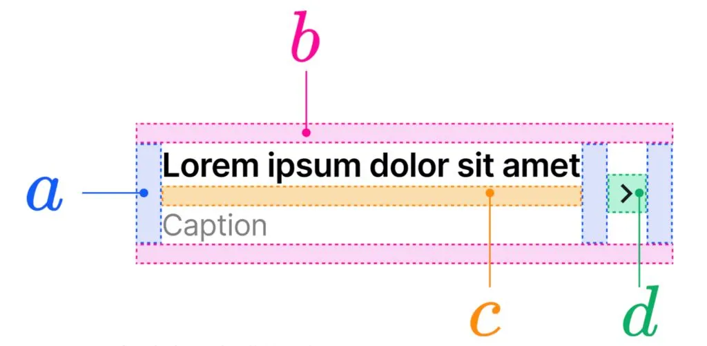
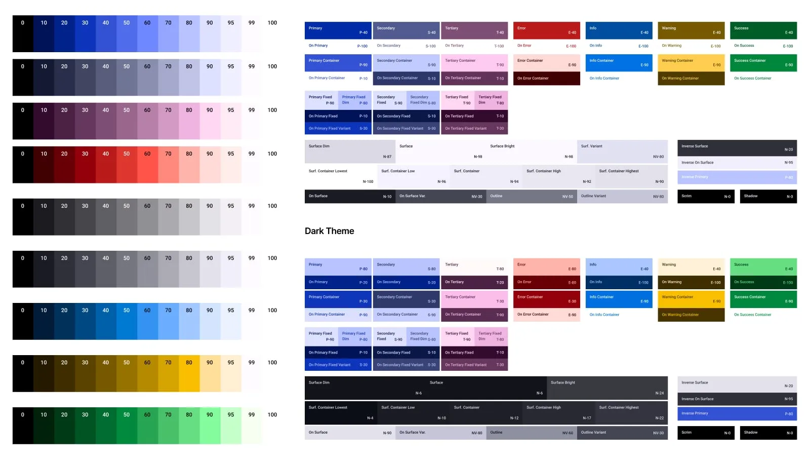
Everything is balanced with Golden Proportions
What is this thing, exactly?
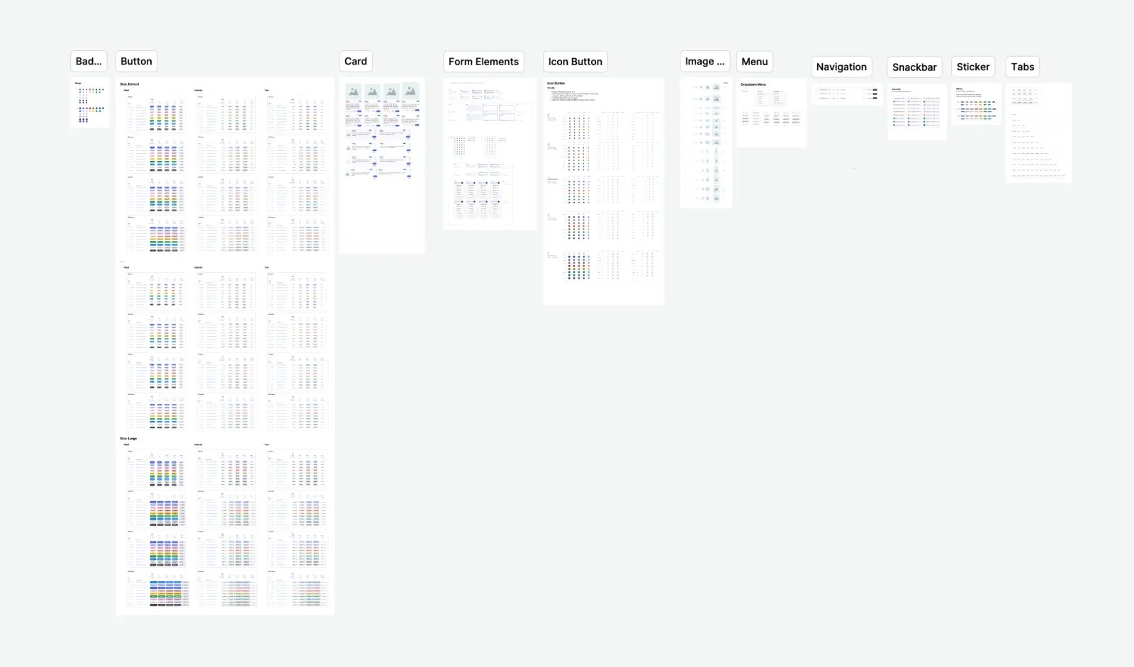
LiftKit is a UI kit that works in Figma, and it also comes with React/Next.js components that match the designs. So whether you’re designing or coding, you’re covered. But it’s not just about the components. It’s the system behind them that’s cool.
Everything is based on a global scale tied to the golden ratio. No random 12, 14, 20px paddings or whatever. It’s all calculated. You can tell the creator is a bit of a perfectionist in the best way.
And yeah, it’s still early. This is the first official release. But even now, it’s way more polished than some paid kits I’ve used.
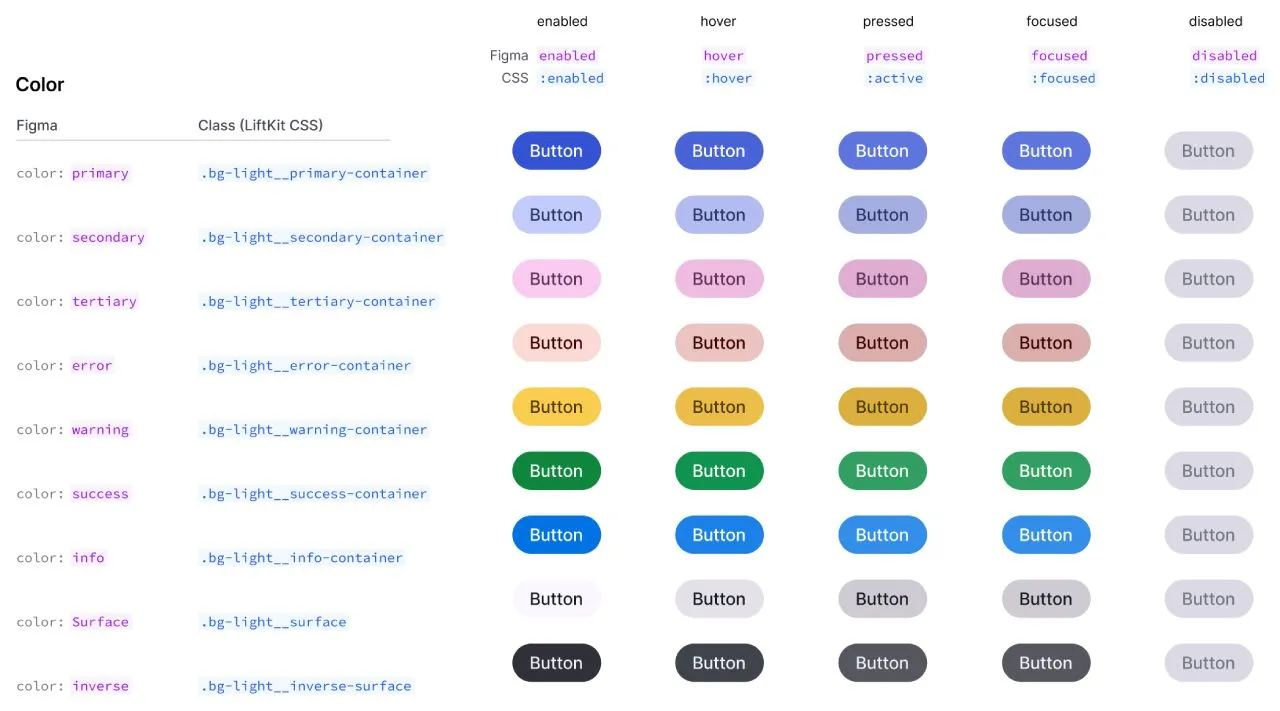
Button components section looks polished and detailed
Why you should care (especially if you’re building stuff solo)
If you're like me and constantly juggling between building product, designing the UI, and actually shipping, you don’t want to waste hours fiddling with spacings and layouts. You just want something that looks clean and doesn’t fight you.
Here’s what LiftKit gives you:
- A ready-to-go Figma kit with solid defaults
- Clean, consistent React components
- Spacing and layout logic that actually makes sense
- And best of all — it's free and open source
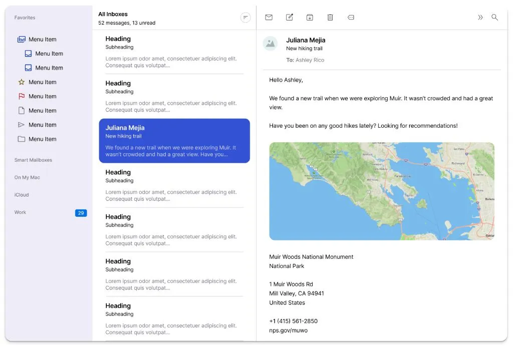
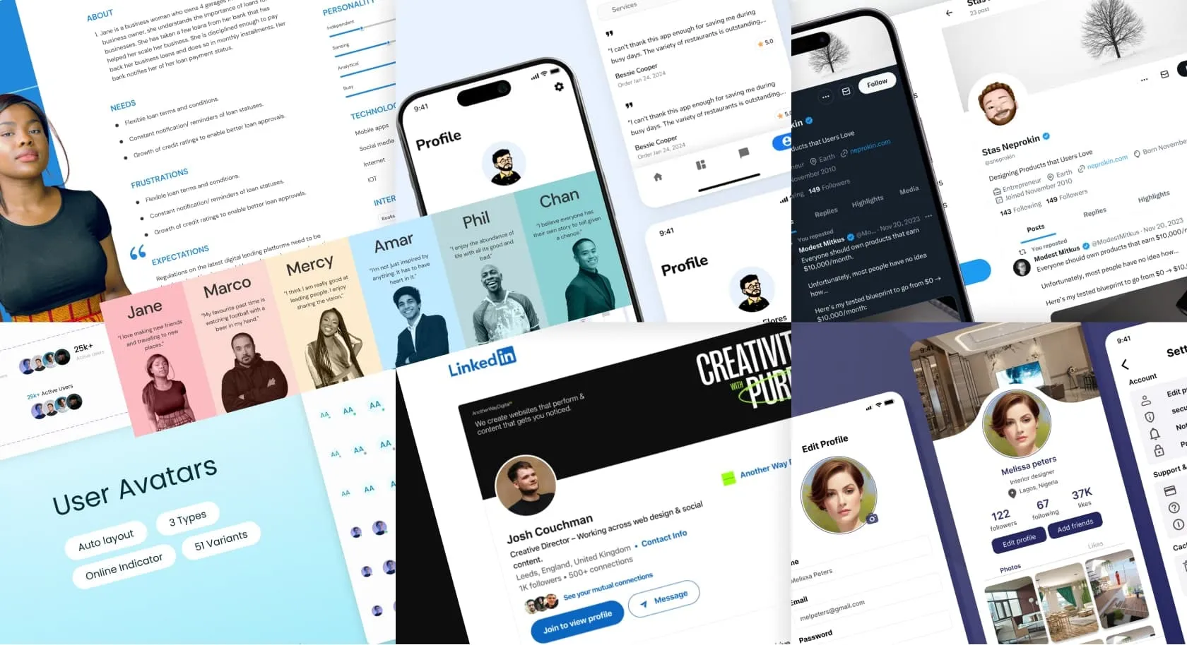
Example of app layout UI made with LiftKit
What’s inside?
→ A Figma file with all the basics: buttons, forms, nav, modals, etc
→ Components that mirror the Figma stuff in React and Next.js
→ A math-driven spacing system that just works
→ Docs that explain how to use the system and how the design logic works
→ A GitHub repo if you want to dive into the code or contribute
It’s clearly a passion project. You can feel the care in every layout and pixel.
Components section is just about getting started! More to come soon
Who this is perfect for
Honestly, if you're:
- a startup founder shipping an MVP
- a solo dev doing it all yourself
- a designer who codes and wants something smart but flexible
- or just someone who’s obsessed with spacing (no shame)
...then you should probably check this out.
It’s not trying to be the biggest design system. It’s trying to be the one that feels good to use.
Final take
What really gets me about this isn’t just the product. It’s the fact that someone sat down and spent a year and a half refining this thing, unpaid, just because they cared about making UI feel better. That’s rare.
It’s open source. It’s useful. And it’s got a brain behind it.
I’m already using it for a side project, and honestly? It’s saving me time and helping stuff look good without overthinking.
Want the links? I’ve got the Figma file, the GitHub repo, and the docs saved. Just say the word. Or go search for “LiftKit design system” and you’ll find it.
Either way, it’s worth a look.


