

Roman Kamushken
Robust design system
Always take into account the possible states of certain components. If before Global Styles there was only one option — always creating a new Component for each state (for example, a text field may be default and may be focused), then after the introduction of styles, many UI elements could be unified to only one in its category, and a variety was created by Instances, attaching only new styles and colors.
This made it possible to reduce the number of elements to the minimum required. The search has become easier, the system has become cleaner. But what if one project often uses several styles for one component? In addition, you often need to switch between two or three ones.
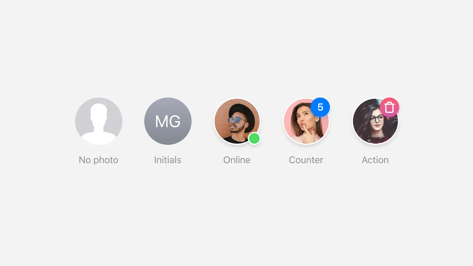
Meet the Userpic
This is the quickest example that may be used in a design project in several states. If you think this is just a round pic with a pretty girl, you aren`t looking far enough, because in fact the userpic can be:
- with no photo uploaded
- with initials instead of a photo
- with online/offline status indicator
- with notification badge
- containing the icon for a custom action
- containing multiple faces for prototyping
- used in different dimensions on different screens without disconnecting
Obviously, we want to get all these states quickly and conveniently. In addition, we want to preserve a minimum of required components. Therefore, the question arises: shall we store all states as hidden layers in the master, or should each state be declared a separate component?
Component by the instance
This method has retained its advantages after Global Styles arrival. Switching an instance is optimal when there are many differences from the parent component. For example, a different color, stroke thickness, shadow, image and so on. For example, it is faster to switch input states through instances.
Especially in a large project with many pages. And, for instance, it`s better to attach the icon inside the button at the master level and disable it. It`s also much faster to copy-paste a button from the nearby artboard and just make a Visible layer with an icon.
Pros: allows you to quickly switch instance states with many differences
Cons: there are obviously more components, it takes time to organise them
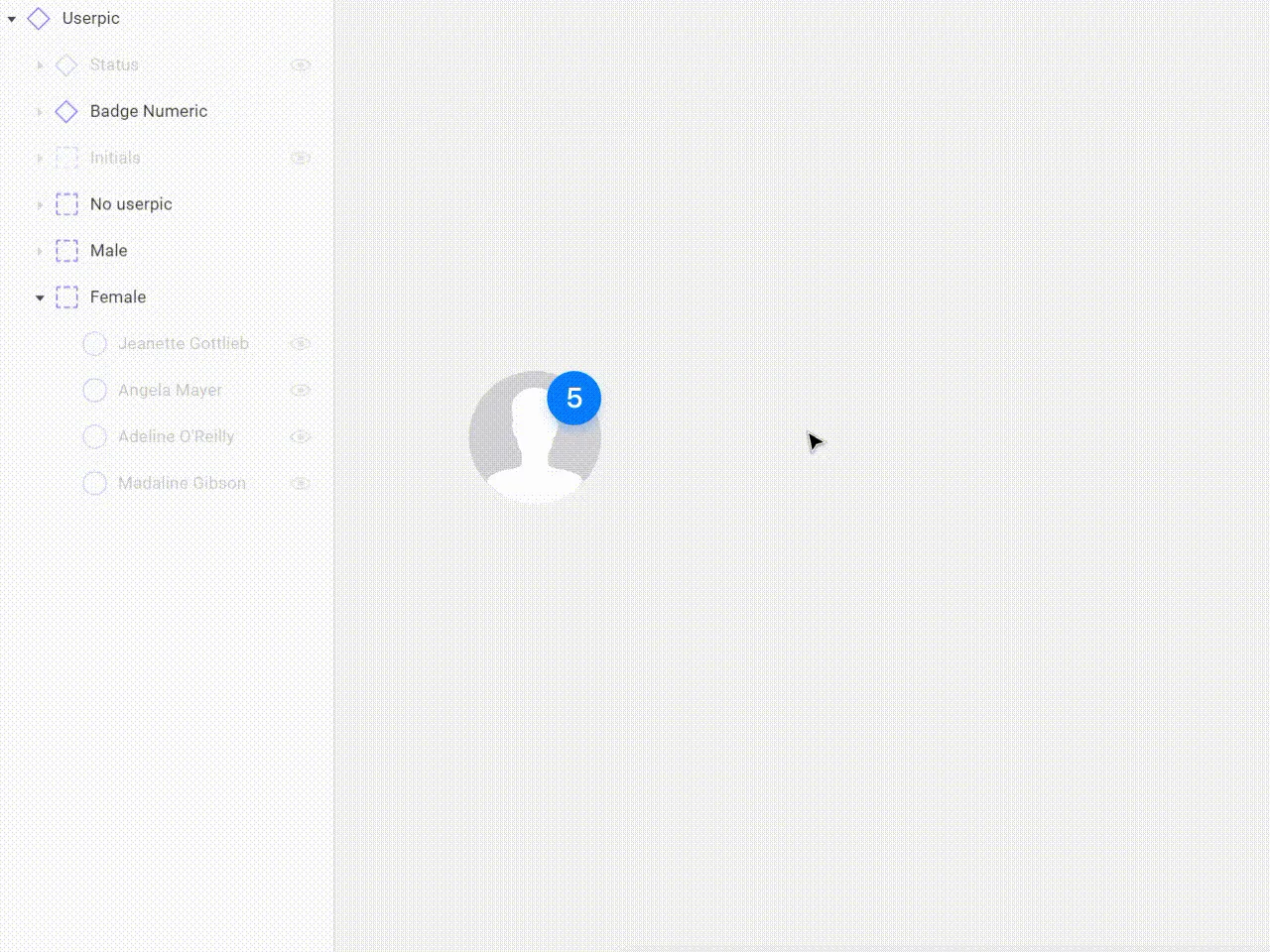
PURCHASE UI KITSHidden layers inside the master component
Nowadays, Figma does a great job with hundreds of instances that contain 5–10 hidden groups with dozens of layers and scattered across a variety of pages. So don`t worry about the performance, although once upon a time, 10 such pages literally hung the project. After all, if you use this method, in addition to the pic, you will just need to cram the following into the Userpic master component and immediately hide that:
- layer or group of vector objects to a blank userpic
- centered text layer for the initials
- notification badge, to the upper right corner
- online/offline status indicator, to the bottom one
- icon to the center of the component or to the corner, for mobile scenarios (e.g. call to edit photo, to delete it)
- multiple face images (5 male, 5 female and everything is grouped in iOS design toolkit)
- arrange Constraints for each element so that Userpic can be used in several sizes
- what else have I forgotten? :
Pros: quickly getting the desired instance state by switching the layers visibility
Cons: if you switch 3+ layers and attach the new styles at the same time, there are too many actions
By creating a new rule, you may be improving your algorithm. I've chosen the following for myself: if creating a new state requires 3 or more layers to be switched to "Visible", it's better to predefine that state to a separate component that was an instance at first. Remember that you'll need to spend time organising, checking the naming of each layer (so that text elements don't lose content when switching), constraints, order… and much more!
_Oh, it seems the simple Userpic turned out to be not that simple. The tools give us a simplification of the design processes, but the complexities come from a completely different side._


