Pixels are easy. Navigating bullshit is the real UX.

Behind every polished UI is a mess of meetings, politics, and quiet battles for alignment. This publication breaks down the part of UX that bootcamps never teach, and why it wears so many of us down.

Real UX work in tech companies
Career

Published on

August 17, 2025

|

5 min read

Tutorials

Real UX work in tech companies

Navigation

Subscribe to new posts

Thank you! Your submission has been received!
Oops! Something went wrong while submitting the form.

By subscribing you agree to with our Privacy Policy.

Share this post

Author image

Roman Kamushken

Intro: The myth we were sold

We all got into UX because we believed in something.
Maybe it was the thrill of solving real user problems, the beauty of good design, or the dream of making things easier, clearer, and more human. We wanted to create elegant solutions. We wanted to be useful.

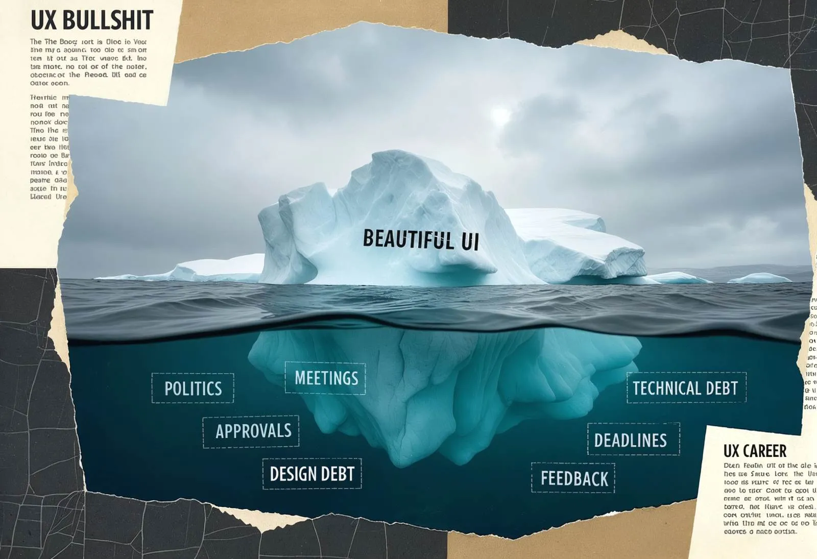
But somewhere along the way, we realized something else: the hard part isn’t the pixels. It’s not the wireframes or flows or accessibility audits. Those are the parts we can do in our sleep. The hard part is getting any of that work to actually ship.

It’s navigating a mess of politics, priorities, power struggles, egos, fiefdoms, and the quiet but constant resistance to change. And no one warned us. No one told us that the real UX job begins after the design is done.

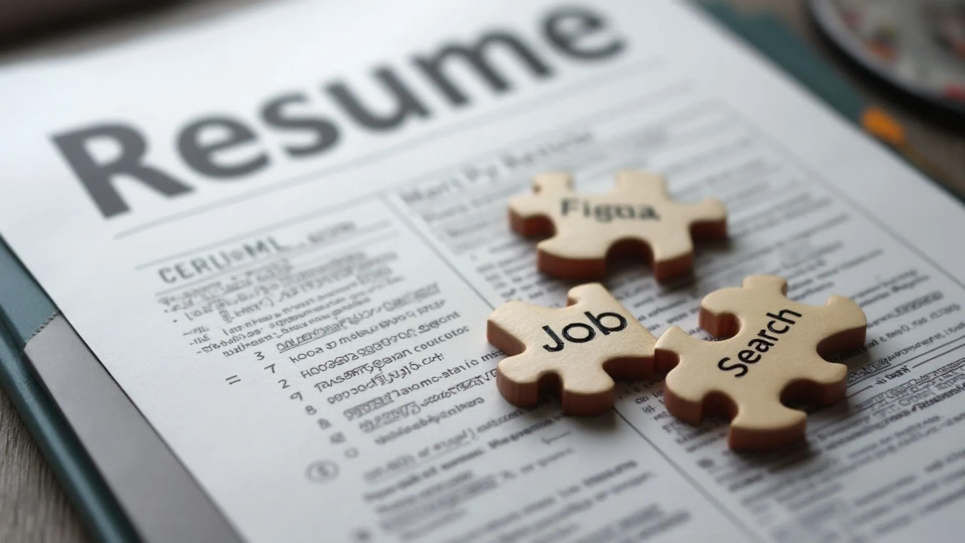
Chapter 1: The hidden job nobody told you about

In school, or bootcamp, or wherever you came from, the job was framed like this:
❶ research the problem, ❷ understand the user, ❸ prototype a solution, ❹ test it, ❺ refine it, ❻ hand it off. Easy game!

But in real life your handoff gets ignored. Your research gets questioned and your solution gets watered down. The PM ghosted, due the dev team has other priorities. Leadership changes direction halfway through the sprint. And now your elegant, thoughtful design is a dead file in a dusty Figma project.

The real job is not just to design. It’s to persuade, align, evangelize, communicate, and adapt; often pitching the same idea ten different ways to ten different people, hoping one of them gets it. It’s relentless.

As one UX veteran on Reddit put it: "The longer I’m in this field, the more I realize the hard part about UX isn’t just about designing great products or features. It’s about actually getting them into production."

And that’s the truth. We’re not just designers:we’re diplomats, translators, strategists, therapists, and sometimes, even punching bags.

This image generated by Venice.ai - your next UI idea can start with a sentence!

Chapter 2: Welcome to office politics, you now live here

No one tells you how much of UX is emotional labor.
You’re managing your team’s insecurities, a PM’s vision, an engineer’s technical constraints, and a director’s KPIs - all while trying to advocate for the actual user.

My fellow designer shared, "Dealing with office politics took more time and drained more of my energy than the most complex design task I ever undertook." That hits because it’s true.

UX becomes a game of optics.

Who supports your work? Who opposes it, quietly or openly? Who can veto it at the last moment? Who needs to feel like it was their idea? Who do you need to pre-align with so your review meeting isn’t a bloodbath?

You start having "pre-meetings" before the actual meetings. You review slide decks before review decks. You walk on eggshells. Not because your design is bad, but because someone in the room might feel threatened by your suggestion.

This is what no bootcamp prepares you for: the slow erosion of clarity by committee. The art of protecting the core of your idea while navigating through sludge.

Chapter 3: When a button takes 18 months

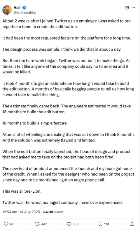
"Just add an edit button."

That’s what started it all. A former Twitter employee shared how a simple feature spiraled into months of work, pushback, and internal chaos. On the surface, it was a button. In practice, it challenged the foundation of the product.

One of the most upvoted replies was a blunt reminder: "If a ‘simple’ feature is obviously broken or missing, there’s a reason for that. The tech stack or management processes are too dysfunctional to have sorted it sooner."

This is a truth that hurts. Designers often get blamed for inaction or slowness.
But behind every dead-on-arrival feature lies a tangled web of legacy systems, disjointed teams, bad assumptions, and "not my job" mentalities.

Even small changes can take months when no one owns the full stack. Or worse: everyone thinks someone else does.

Chapter 4: You are not an artist and that’s OK

There comes a moment in every UX career when you realize: you’re not here to make pretty things.
You’re not paid to be creative; you’re paid to be effective
.

And that hurts, especially if you came from a design background. It feels like you sold out. It feels like you lost the thing that brought you here.

But what if you didn’t lose it? What if this is the next level?

One comment in the thread, I mentioned above, nailed it: "They’re not paying us to do arts and crafts. Businesses hire employees because they expect that employee to make them more money than it costs to hire them."

This doesn’t mean abandoning craft. It means understanding how to weaponize it.

You still care about type scales and contrast ratios. But you also care about adoption rates, support tickets, drop-off points, retention. You start caring about problems that your users don’t even know they have yet.

You mature.

Chapter 5: When you thought it was just about good UX

A lot of us feel betrayed. We thought we were signing up for user advocacy, clean interfaces, and thoughtful flows. Instead, we found ourselves locked in rooms with people who don’t understand UX and don’t want to.

One senior designer said: "Those who survive are those who excel at delivering business value, not necessarily those who excel at the design process."

That stings. Because it forces us to ask: are we in the wrong field? Or are we just playing the game on hard mode?

Maybe we were naive. But maybe that idealism is still useful. Maybe the frustration we feel is the tension between what UX could be, and what we’re allowed to make it.

And maybe that tension is where the real work lives.

Chapter 6: What should you do with all this information

If you've made it this far, chances are you’ve seen some version of this chaos in your own UX work. Perhaps, you’ve lived through the invisible battles, felt the weight of unspoken politics, or quietly questioned if this job is still about designing for users at all.

So now the question becomes: what do you do with all of this?

You don’t need a career pivot or a new title. You need a clearer lens.

Start here:

  • Stop internalizing the mess.
    The dysfunction around you is not a reflection of your skill. Most of what wears UX people down isn’t in the craft, it’s in the friction between craft and context. Recognize that, and you stop feeling like you’re bad at your job.
  • Shift your definition of “good UX”.
    It’s not just beautiful flows or clever interactions. Good UX might look like: saying something hard in a meeting, rerouting a bad idea before it becomes a feature, or earning enough trust that people actually listen when you talk about users.
  • Pick your battles. Then document the wins.
    Don’t try to fix everything. Fix what you can reach. And when something works - capture it. Build a quiet proof-of-trust portfolio. Not for Dribbble. For yourself.
  • Reframe your influence.
    You’re not “just” a designer. You’re a translator, a connector, a negotiator, sometimes a therapist. The sooner you own those roles, the sooner they become strategic, not invisible.
  • Protect your energy.
    Seriously. If this chapter hit too close to home, it means you care. But caring doesn’t mean carrying everything. Step back when you need to. Rest. You’re not a bottleneck. Treat yourself like one.

You don’t need to be perfect. You just need to stay aware, stay adaptive, and stay human.

That’s the real job now.

Outro: You were never just a designer

If you’ve ever walked out of a meeting feeling like your soul got stepped on, this post is for you.

If you’ve ever spent weeks getting everyone aligned just to ship a feature no user even notices, it's for you.

If you’ve ever wondered if you’re burned out or just fed up with bullshit... Is for you.

Because this is the job. It’s messy. It’s political. It’s draining.

But it’s also important. And it’s yours.

You weren’t wrong to believe in good design, to want to make things better, or to care deeply about the outcome.

But now you know: caring isn’t enough. Designing isn’t enough.

Shipping is the hard part.

And navigating bullshit (quietly, strategically, persistently) is the real UX.

Share this post

Subscribe to Setproduct

Once per week we send a newsletter with new releases, freebies and blog publications
Thank you! Your submission has been received!
Oops! Something went wrong while submitting the form.

By clicking Sign Up you're confirming that you agree with our Terms and Conditions.

Congratulations!

You're in! Expect awesome updates in your inbox

FAQs

Lorem ipsum dolor sit amet, consectetur adipiscing elit. Suspendisse varius enim in eros elementum tristique.
No items found.

Our Dashboard Templates Will Make It A Treat To View Data

Experience the magic of data visualization with our user-friendly dashboard templates. Try out our dashboards now and enjoy efficient reporting processes, greater transparency in, among others monitoring and making educated decisions easily.
Material X for Figma

Material X for Figma

Figma library with 1100+ components & 40 app templates beyond Material Design. Powered by top-notch shapes and Manrope font. Customizable & Adjustable UI kit now available for Angular & Figma

Material You UI kit

Material You UI kit

Figma & React library with 2600+ variants of 32 components compatible with Material Design 3. Plus 220+ dashboard templates for all the viewports. Now available for NextJS & TailwindCSS.

Figma React UI kit

Figma React UI kit

Designed and well-organized in Figma React-based UI toolkit for the web. Optimized for building complex data-dense interfaces for desktop and mobile applications.

Panda Design System

Panda Design System

Figma library with dashboard, calendar, kanban, profile, table, ecommerce and 80+ templates in total. Components with variants, dark theme included.

Eclipse UI kit

Eclipse UI kit

Figma library with 1100+ components & 74 templates for data-driven web applications. Powered by auto-layout. Supercharged by Figma's variants.

Rome UI kit for Figma

Rome UI kit for Figma

Customizable and well-organized team library. Contains 250+ components & 30 web app templates powered by stylish and trendy guidelines.

Material Design System

Material Design System

Figma library is based on 100% guidelines compliance with Material.io. Contains ready‑to-use templates to accelerate app UI design.

Neolex Dashboard UI kit

Neolex Dashboard UI kit

Customizable & adjustable dashboard design system with 50+ ready-to-use app layouts, 1900+ variants for 30 components with auto-layout.

Material Desktop Dashboard UI kit

Material Desktop Dashboard UI kit

Figma library with 48+ dashboard templates based on reusable desktop app patterns carefully handpicked from the most popular web apps.

Xela UI kit for Figma

Xela UI kit for Figma

Figma library with 1900+ variants of 30 components categories to craft perfectly shaped desktop & mobile apps. Customizable & Adjustable dashboard design system with 50+ web app templates.

Figma S8 Design System

Figma S8 Design System

Figma design library for mobile and desktop apps made of high quality styled components. Full version includes 67 dashboard templates.

OE Figma Design System

OE Figma Design System

Customizable and well-organized Figma library. This design system aimed to build highly loaded interfaces, boost the speed and save more costs.

Related posts

Lorem ipsum dolor sit amet, consectetur adipiscing elit.

Career

4 min read

Why designers are losing motivation and how to fix it

Understand why many designers are feeling unmotivated and learn how to break free from the cycle of burnout. Find your path to a fulfilling design career.

Career

3 min read

Insights from the hiring frontlines to craft a stellar UX portfolio

Learn how to create a standout UX design portfolio with expert tips from hiring managers. Discover UX portfolio tips, UI design essentials, and graphic design best practices to land your dream job.

Career

2 min read

The risks of using Figma to build your PDF resume

Reveal how using Figma to build your PDF resume can strike your job chances. Learn the common mistakes and how to create a job-winning resume.

Figma Templates & UI kits

Save time and human resources by reusing hundreds of pre-made templates crafted by us. Based on top notch UX taken from the World's best apps.

Material X for Figma

Figma library with 1100+ components & 40 app templates beyond Material Design. Powered by top-notch shapes and Manrope font. Customizable & Adjustable UI kit now available for Angular & Figma

Material You UI kit

Figma & React library with 2600+ variants of 32 components compatible with Material Design 3. Plus 220+ dashboard templates for all the viewports. Now available for NextJS & TailwindCSS.

Figma React UI kit

Designed and well-organized in Figma React-based UI toolkit for the web. Optimized for building complex data-dense interfaces for desktop and mobile applications.

Panda Design System

Figma library with dashboard, calendar, kanban, profile, table, ecommerce and 80+ templates in total. Components with variants, dark theme included.

Eclipse UI kit

Figma library with 1100+ components & 74 templates for data-driven web applications. Powered by auto-layout. Supercharged by Figma's variants.

Rome UI kit for Figma

Customizable and well-organized team library. Contains 250+ components & 30 web app templates powered by stylish and trendy guidelines.

Material Design System

Figma library is based on 100% guidelines compliance with Material.io. Contains ready‑to-use templates to accelerate app UI design.

Neolex Dashboard UI kit

Customizable & adjustable dashboard design system with 50+ ready-to-use app layouts, 1900+ variants for 30 components with auto-layout.

Material Desktop Dashboard UI kit

Figma library with 48+ dashboard templates based on reusable desktop app patterns carefully handpicked from the most popular web apps.

Xela UI kit for Figma

Figma library with 1900+ variants of 30 components categories to craft perfectly shaped desktop & mobile apps. Customizable & Adjustable dashboard design system with 50+ web app templates.

Figma S8 Design System

Figma design library for mobile and desktop apps made of high quality styled components. Full version includes 67 dashboard templates.

OE Figma Design System

Customizable and well-organized Figma library. This design system aimed to build highly loaded interfaces, boost the speed and save more costs.

Figma iOS kit

Figma library of iOS patterns served as ready-made templates. This UI kit inspired by World's best apps. Based on Human Interface guidelines.

Figma S8 Design System

Figma design library for mobile and desktop apps made of high quality styled components. Full version includes 67 dashboard templates.

Most iOS UI kit for Figma

iOS native components and app templates organized into a «Most Design System» fully compatible with Apple's Human Interface guidelines.

Rome UI kit for Figma

Customizable and well-organized team library. Contains 250+ components & 30 web app templates powered by stylish and trendy guidelines.

Material Design System

Figma library is based on 100% guidelines compliance with Material.io. Contains ready‑to-use templates to accelerate app UI design.

Nucleus UI

Nucleus UI contains 1000 components and variants with 500+ mobile screens designed for Figma (including 9 themes from Event, E-commerce, Finance, NFT, etc.).

Figma Android UI kit

Components-driven Android mobile UI library for Figma. Consists of 140 high quality application templates made of total 250+ UI components.

Mobile X UI kit

Customizable & adjustable iOS / Android design system loaded with ready-made 157 app templates based on 860+ variants for 20 components.

Appka iOS UI kit

Customizable & adjustable iOS design system with 4100+ variants for 28 components and 280+ ready-to-use app layouts crafted for Figma.

Full iOS UI kit

Customizable iOS design system with 320 ready-to-use app layouts. You can modify them or use as it is to save time and never design from scratch again.

Xela for Flutter

XelaUI for Flutter is a simple, modular and accessible component library that gives you the building Flutter apps for mobile and desktop.

Xela for Android

Ready-made collection of fully customizable widgets, UI screens and reusable components for Android coded with Jetpack Compose.

Xela for Swift

Designed for iOS Developers. We provide fully coded customizable components, widgets and well-organized iOS screens for Figma & SwiftUI.

Material You UI kit

Figma & React library with 2600+ variants of 32 components compatible with Material Design 3. Plus 220+ dashboard templates for all the viewports. Now available for NextJS & TailwindCSS.

Figma Charts UI kit

Components-driven graphs design kit for dashboards, presentations, infographics & data visualisation. Includes 25+ charts types for all the viewports.

Hyper Charts

Create impressive visuals with Figma's graphs templates – dozens of scalable and customizable data visualization blocks for dark and light modes.

Orion UI kit

Figma library with 40+ full-width charts templates served in light & dark themes. Contains 200+ of dataviz widgets that look perfect on desktop & mobile screens.

Xela for React

React based components library for beautiful user interface in React apps. Lightweight library for your projects. Contains pre-made web app templates.

Figma React UI kit

Designed and well-organized in Figma React-based UI toolkit for the web. Optimized for building complex data-dense interfaces for desktop and mobile applications.

Material X for Figma

Figma library with 1100+ components & 40 app templates beyond Material Design. Powered by top-notch shapes and Manrope font. Customizable & Adjustable UI kit now available for Angular & Figma

Xela for Flutter

XelaUI for Flutter is a simple, modular and accessible component library that gives you the building Flutter apps for mobile and desktop.

Xela for Android

Ready-made collection of fully customizable widgets, UI screens and reusable components for Android coded with Jetpack Compose.

Xela for Swift

Designed for iOS Developers. We provide fully coded customizable components, widgets and well-organized iOS screens for Figma & SwiftUI.

Material You UI kit

Figma & React library with 2600+ variants of 32 components compatible with Material Design 3. Plus 220+ dashboard templates for all the viewports. Now available for NextJS & TailwindCSS.

Xela for React

React based components library for beautiful user interface in React apps. Lightweight library for your projects. Contains pre-made web app templates.

Levitate 3D kit for Figma

Components-driven 3D kit to design eye-catching Figma presentations. Helps to enhance your landing page, product or app, brand ident, etc.

Website templates UI kit

Landing pages reusable templates kit based on most effective web design patterns. 140+ dark & light constrained design blocks.

Figma Landing Pages UI kit

Landing pages templates library based on constrained & organized components aimed to speed-up the production of effective websites.

Zeus UI kit

Create hassle-free landing pages in Figma. This kit is based on 10 landing page templates, powered by 1600+ variants for 630+ web blocks.

This is some text inside of a div block.