

Jamshed Kasimov
It's time to Material Design redesign
When it comes to using a design system for an enterprise, many companies and independent freelancers choose Material Design. No wonder: this is one of the most popular and frequently used design systems visual language.
When Google first presented its visual language in 2014, it was a complete game-changer. The interfaces of all services and products of the company were unified and contributed to the easiest and intuitive perception of the interface by the user.
However, the world kept changing since then, and now it is obvious that Material Design has some flaws:
Outdated UI. Since its release in 2014, there have been no global changes in MD's user interface. And it seems that Google will not improve the UI in 2021 as well.
Yes, it's visual language remains one of the most popular, but the design is a constantly changing environment. If you look at Microsoft, Adobe or Salesforce and their design systems (Fluent, Spectrum and Lightning, respectively), you can understand what the modern UI looks like nowadays.
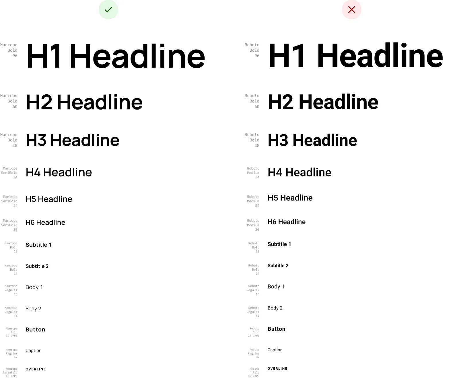
Outdated typeface. Don't get us wrong - we loved Roboto, but it's time to suggest something new. Especially when we talk about such an essential thing for design systems as fonts.
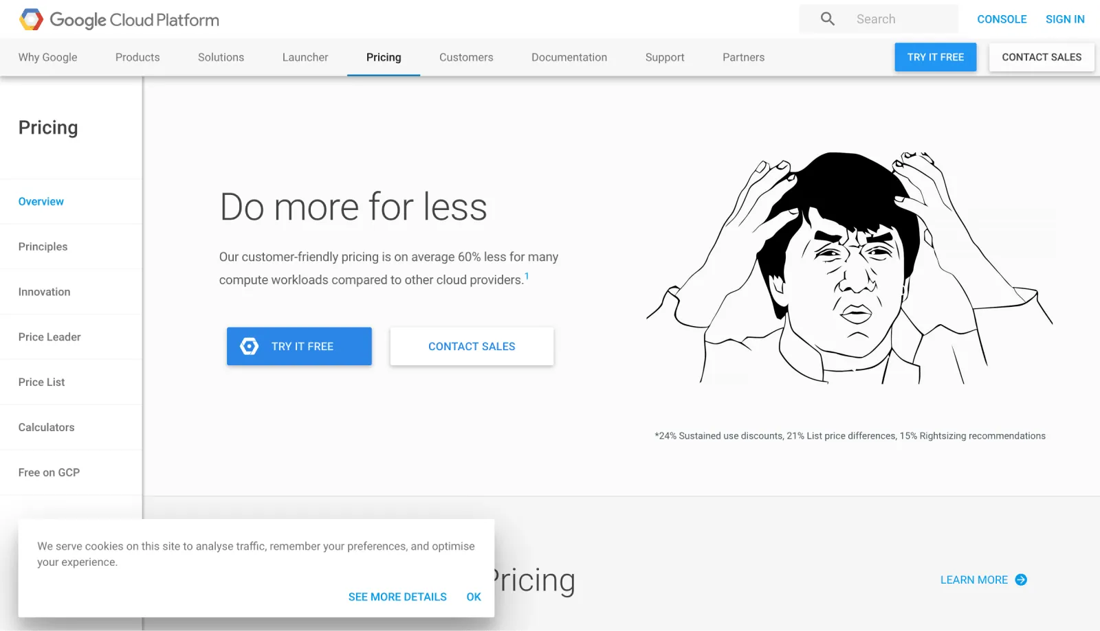
Dirty shadows. Let's admit it - they are not very attractive. Just take a look at the cookies message, application bar and buttons over it in the image below:
Taking all the foregoing into account, we as designers strive to improve the visual world, and Setproduct wanted to make its contribution so that Material Design continues to be relevant.
This is how Material-X was born. In this constantly evolving design system, we have collected all the trends of recent years, taking the legacy of Google's classic design system to a new level. Thanks to it, you can create cool, effortless, and beautiful designs for Android apps and websites with more trendy styles.
And yes, we kept all the specifications of the original, including an 8dp grid, implementing everything with Figma best practices (AutoLayout, Variants, etc.).
Improvements that Material-X provides
Our main goal was to create a MD-based design system with a fresh look, where simplicity and responsiveness are combined with elegance and audacity. So, consider this our vision of Material Design that meets today's and tomorrow's UI challenges.
We worked hard to assemble 1100+ multifunctional pre-made components, 40+ beautiful templates, 1900+ icons (CSS and bootstrap) into one easy-to-use UI kit so that people could have the most comprehensive MD-based design system at hand.
Here is the list of upgraded features:
A modern typeface
We chose Manrope as the lead font. It is compatible with over 40 languages and supports Latin and Cyrillic. It is complemented by IBM Plex font, as well as the outdated Roboto, and the classic Inter.
Manrope looks elegant and it's perfect for UI design, presentations, or showing numerical data.
Shadows with reflections
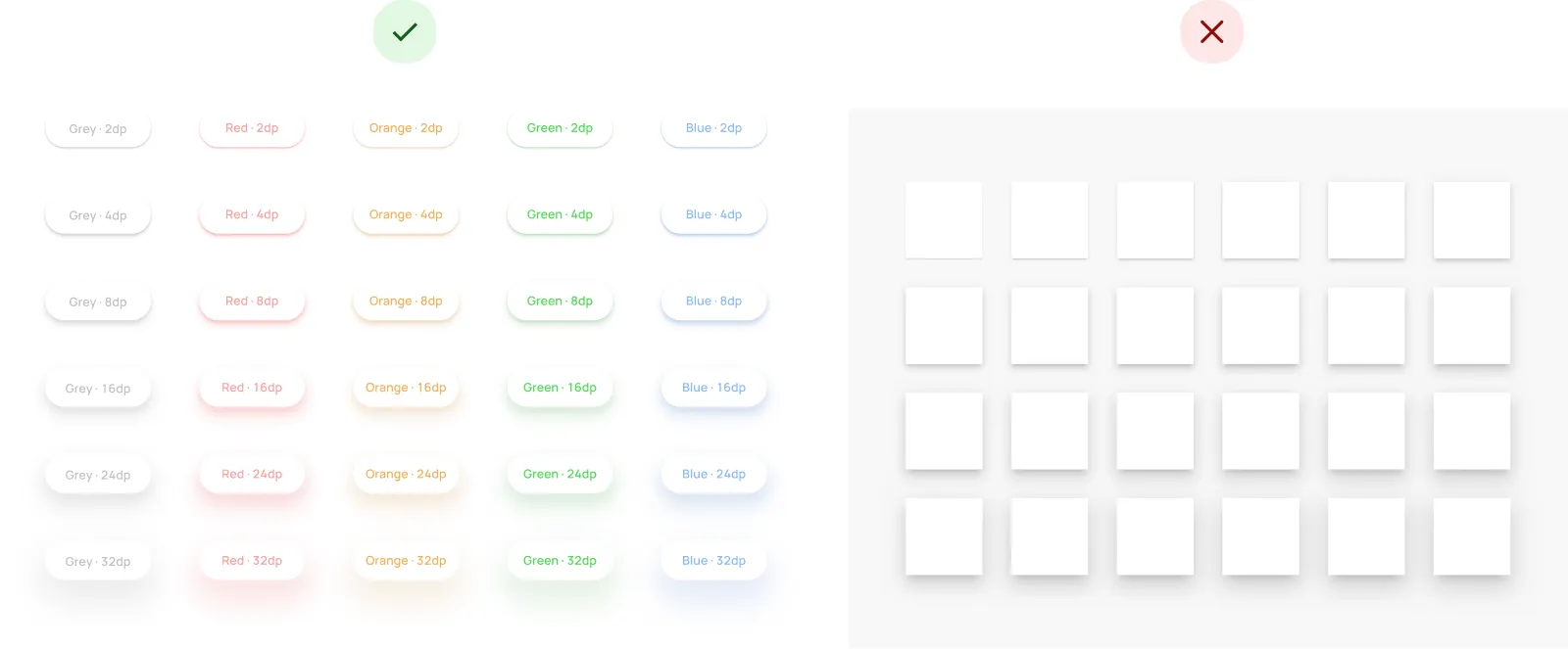
First of all, we wanted to make the shadows as soft, clean, and modern as possible. Secondly, in the material world, objects have reflections that match the surface, so we believe that to have a beautiful UI, the choice of shadows should match the colors of the system:
Buttons with presets
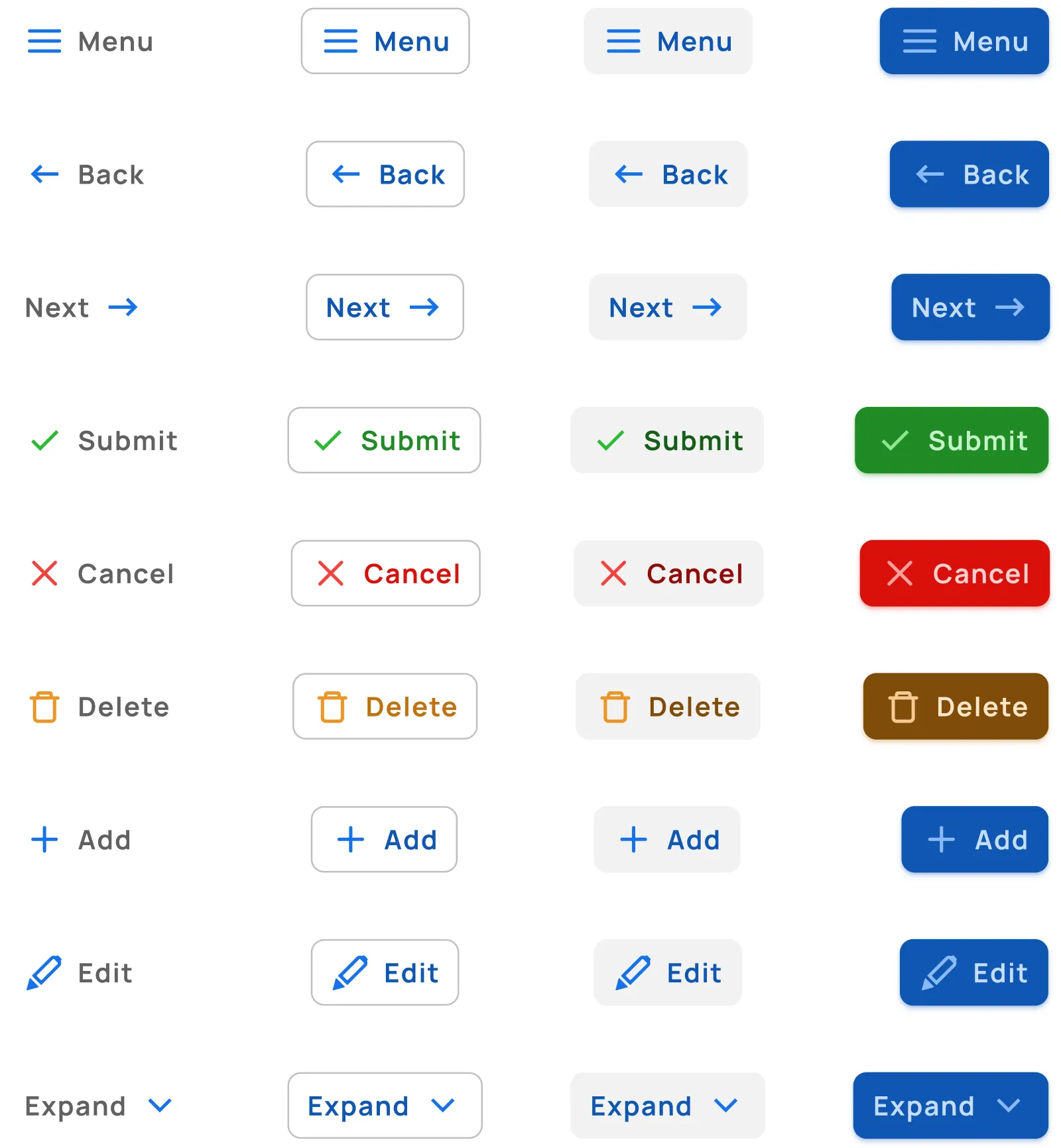
We made sure that our system has all kinds of icons, labels, and other elements. That's why we selected the most frequently used buttons in the interfaces and delivered them in a pre-made format. Just choose what you need and use them without any hassle:
Non-standard rounding
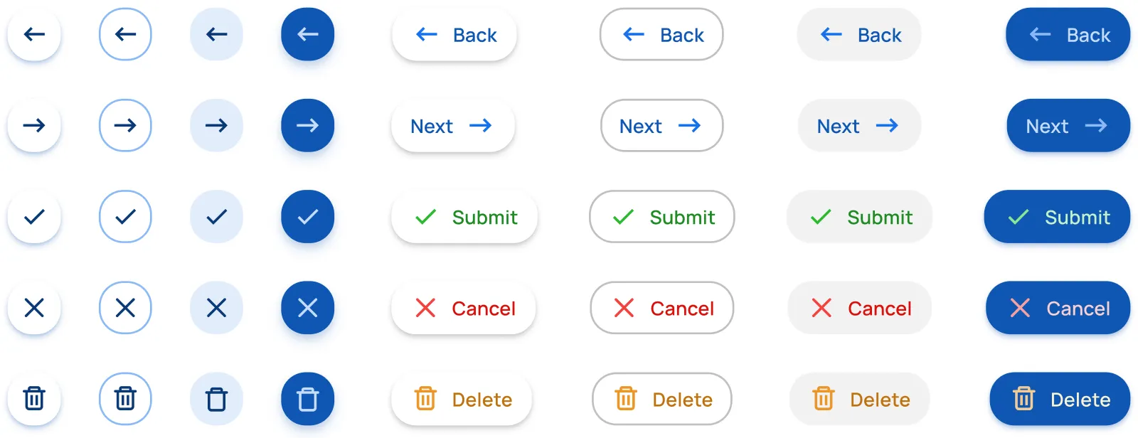
This is one of the few tiny UI details you will not notice till you get too close. Now, zoom in, please. Do you think these buttons are 100% rounded or not?
Tab bars with adjustable FAB
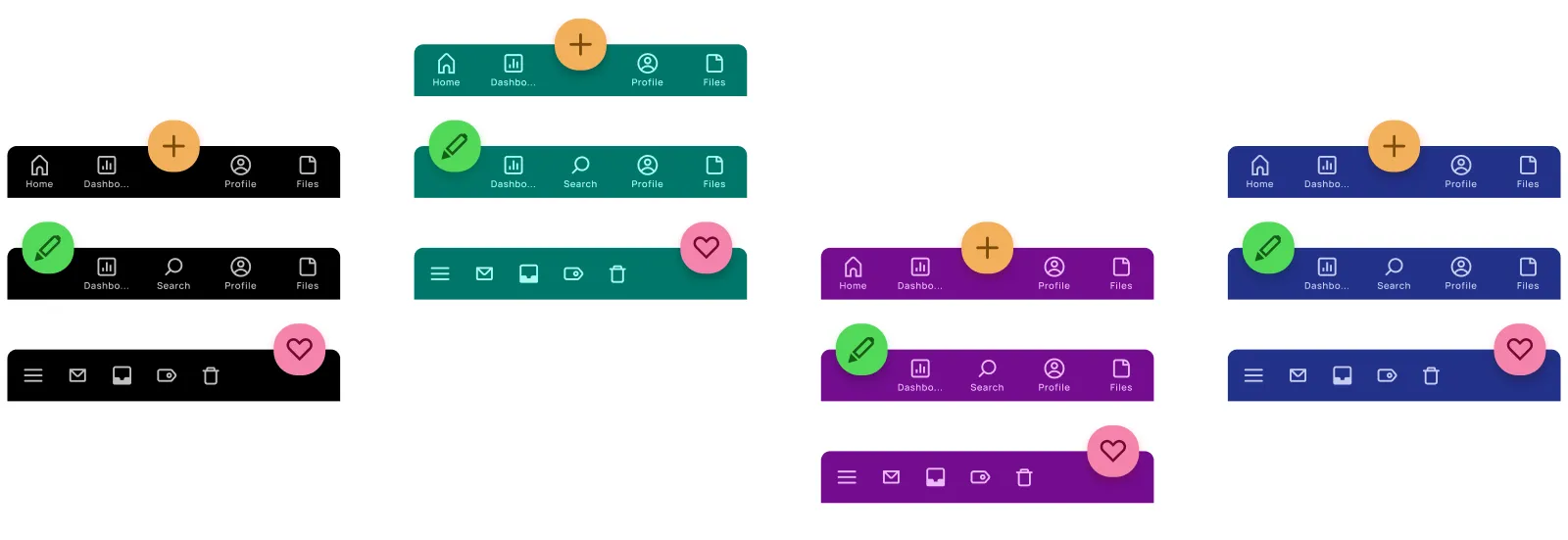
Each tab bar component is equipped with a rounded button inside the Autolayout container. Now FAB positioning in tab bars is flexible and doesn't require to detach. If you want – you can position it in the center, or move it to the right or left. Or make it hidden. Everything is in your hands:
Inputs for all occasions
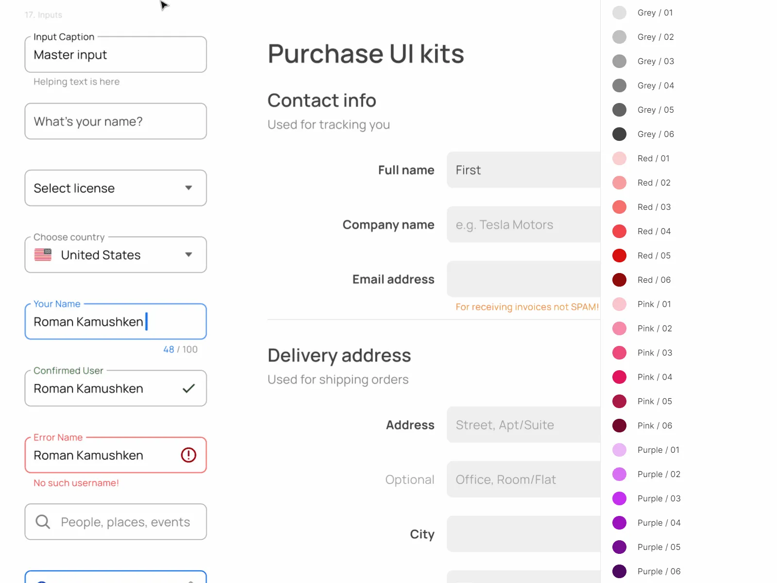
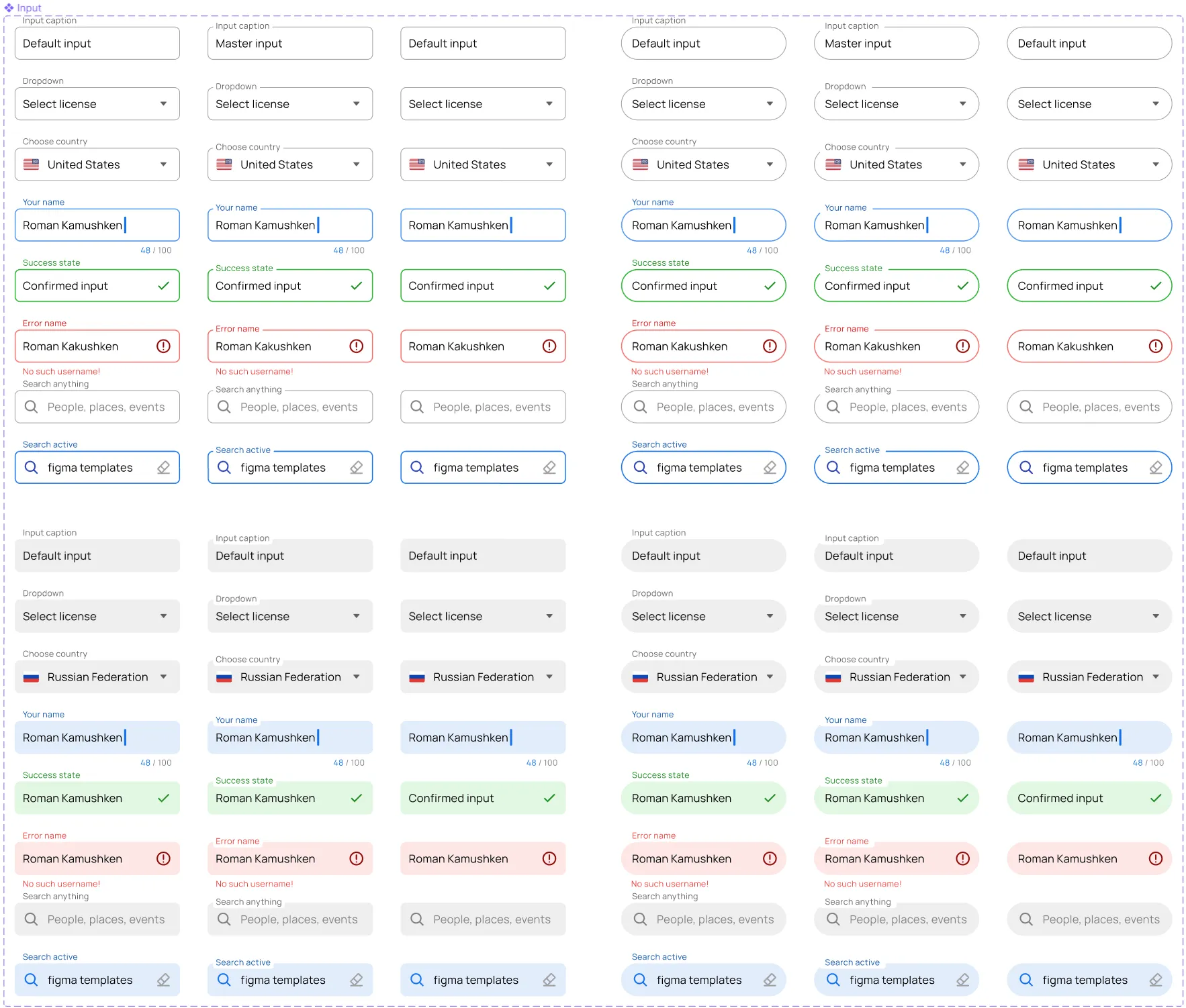
In Material-X you will find a huge number of spectacular inputs, as well as their states, such as: Active, Inactive, Confirmed, Error, etc. + we added a cool microfeature with a pop-up Caption outside the stroke if you want a complete variety of actions:
Detailed and fancy tables
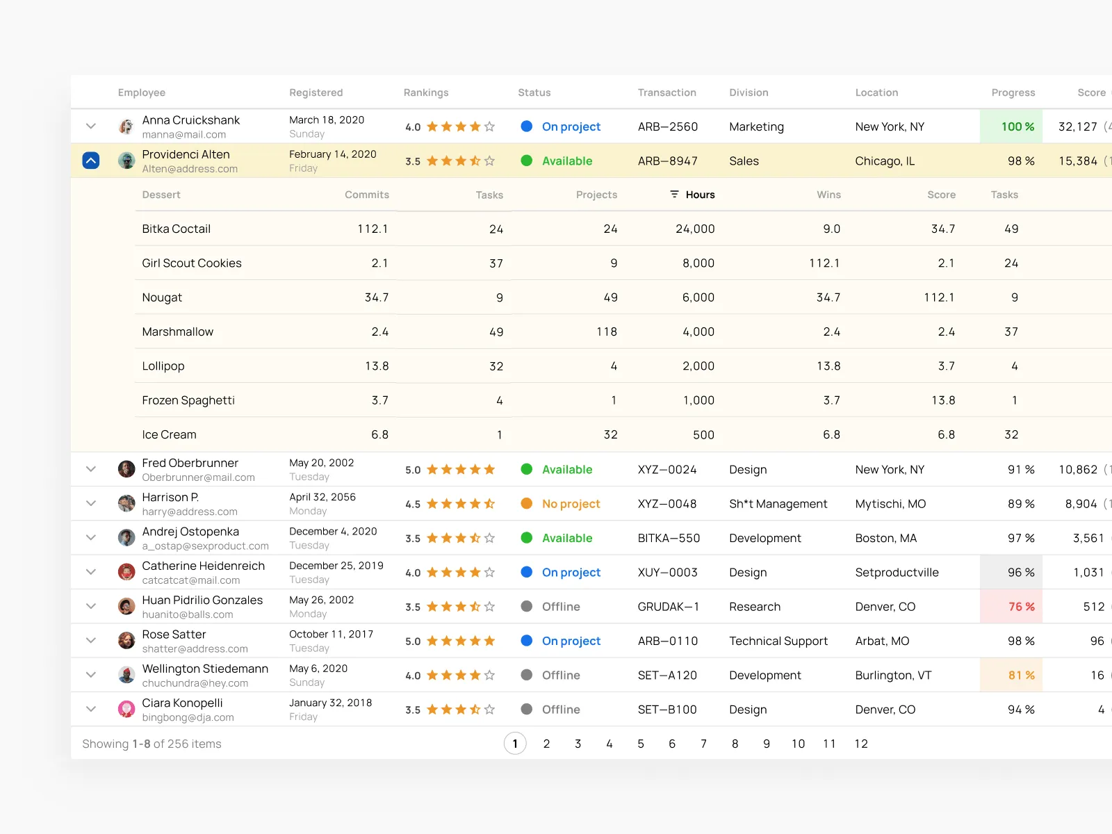
They are perfect for the enterprise. The companies considering purchasing UI kits more often, especially startups. After all, these convenient tables have very flexible settings, and they can be used for a variety of projects. Crafted with cell components which were wrapped into Variants in addition:
Stylized pickers
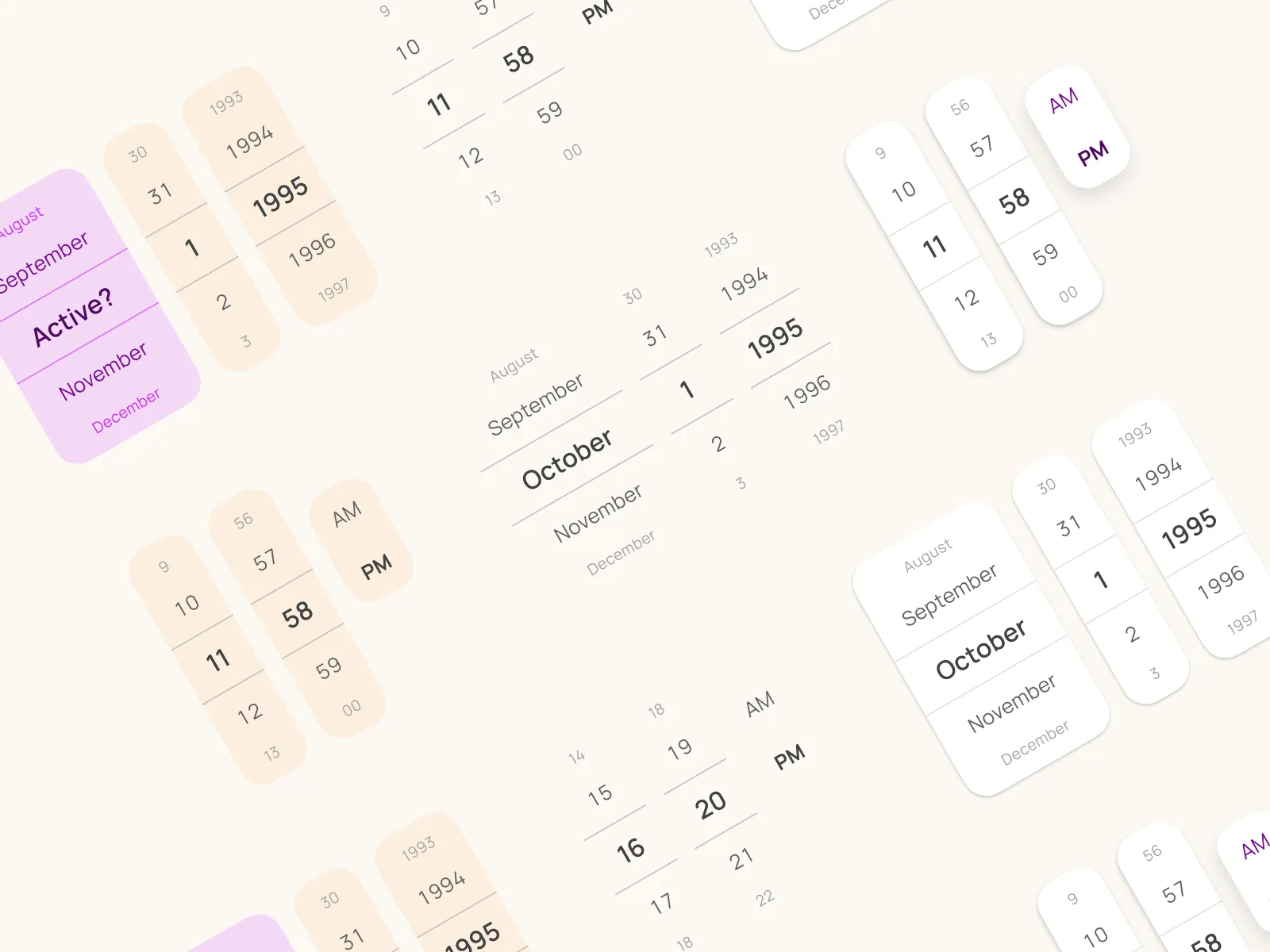
Of course, we want you to hover over an area in desktop interfaces and then spin the reel using the mouse wheel. This is, of course, the responsibility of your developers. But here, we are happy to announce that we are already preparing a plan to create an entire Material-X ecosystem that will work on React / Angular as well.
Lots of ready-made presets
All of them are made on a mobile-first basis, and we tried to make them intuitive (yes, we took into account the cases when people complained that they did not understand certain elements in the Material Design interface).
So just insert these presets into your projects, replace labels with placeholders. Those templates were dedicated to save your time and themify your app quickly:
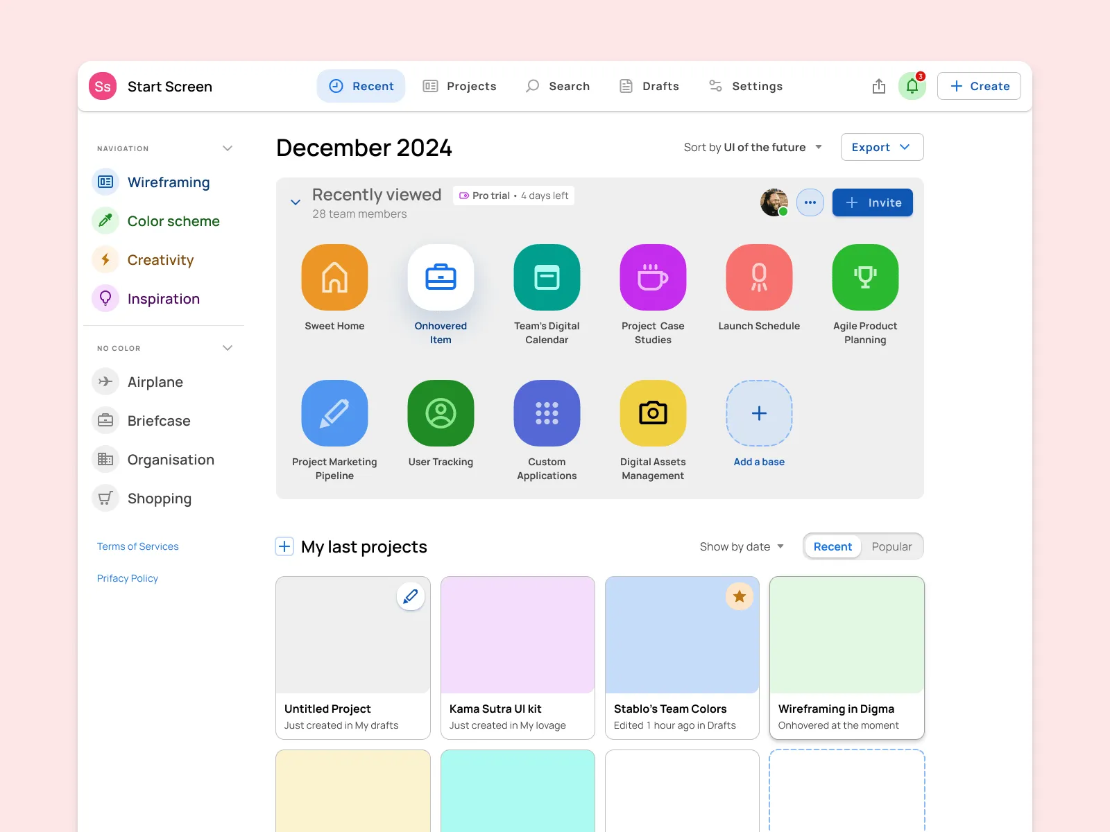
On the widgets page
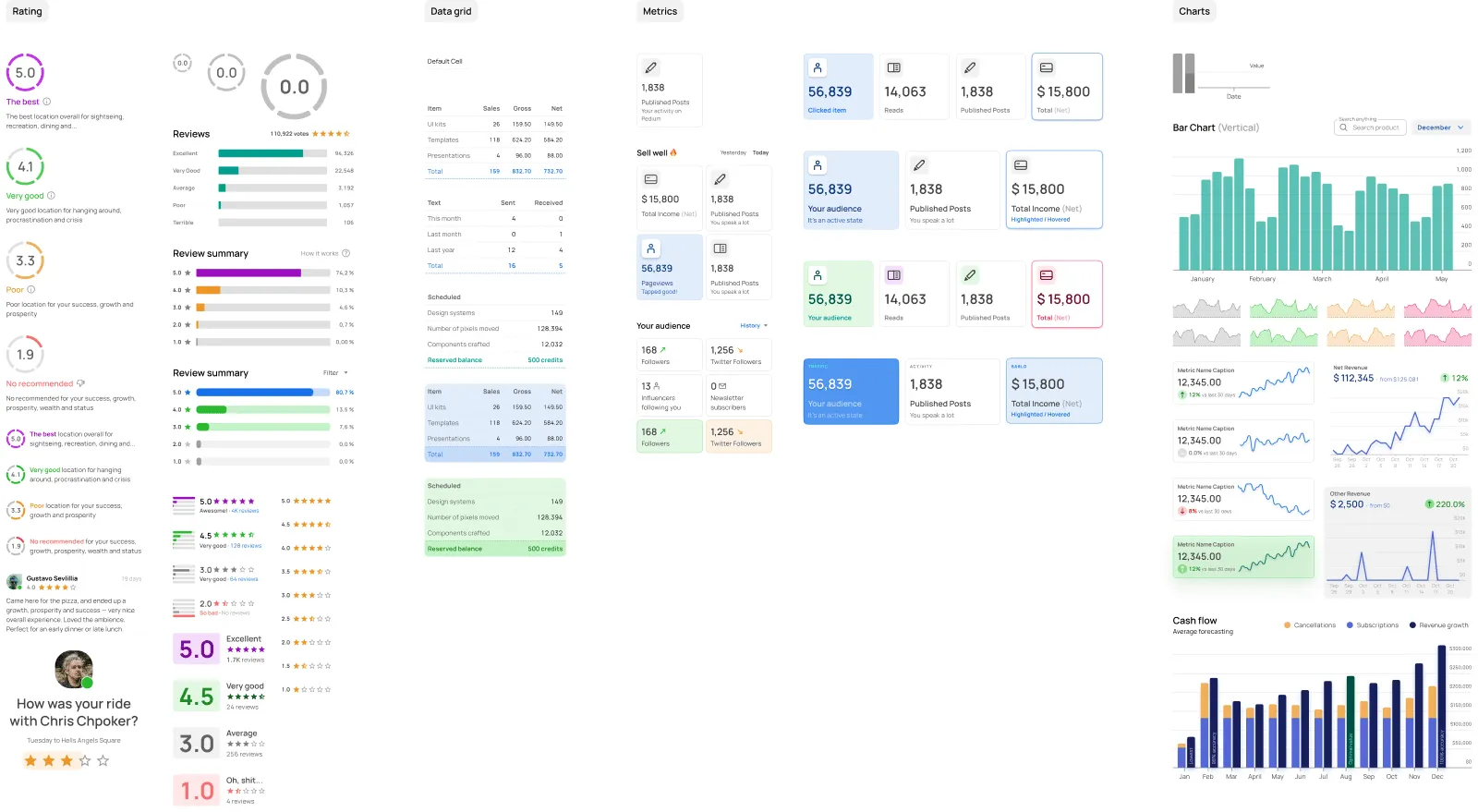
After switching to a Widgets page, you will find a variety of UI components that are suitable for both mobile and desktop web applications: Filters, Galleries, Ratings, Datagrids, Metrics, Charts, and much more.
This section significantly extends the range of cases Material–X is aimed to cover:
On the templates page
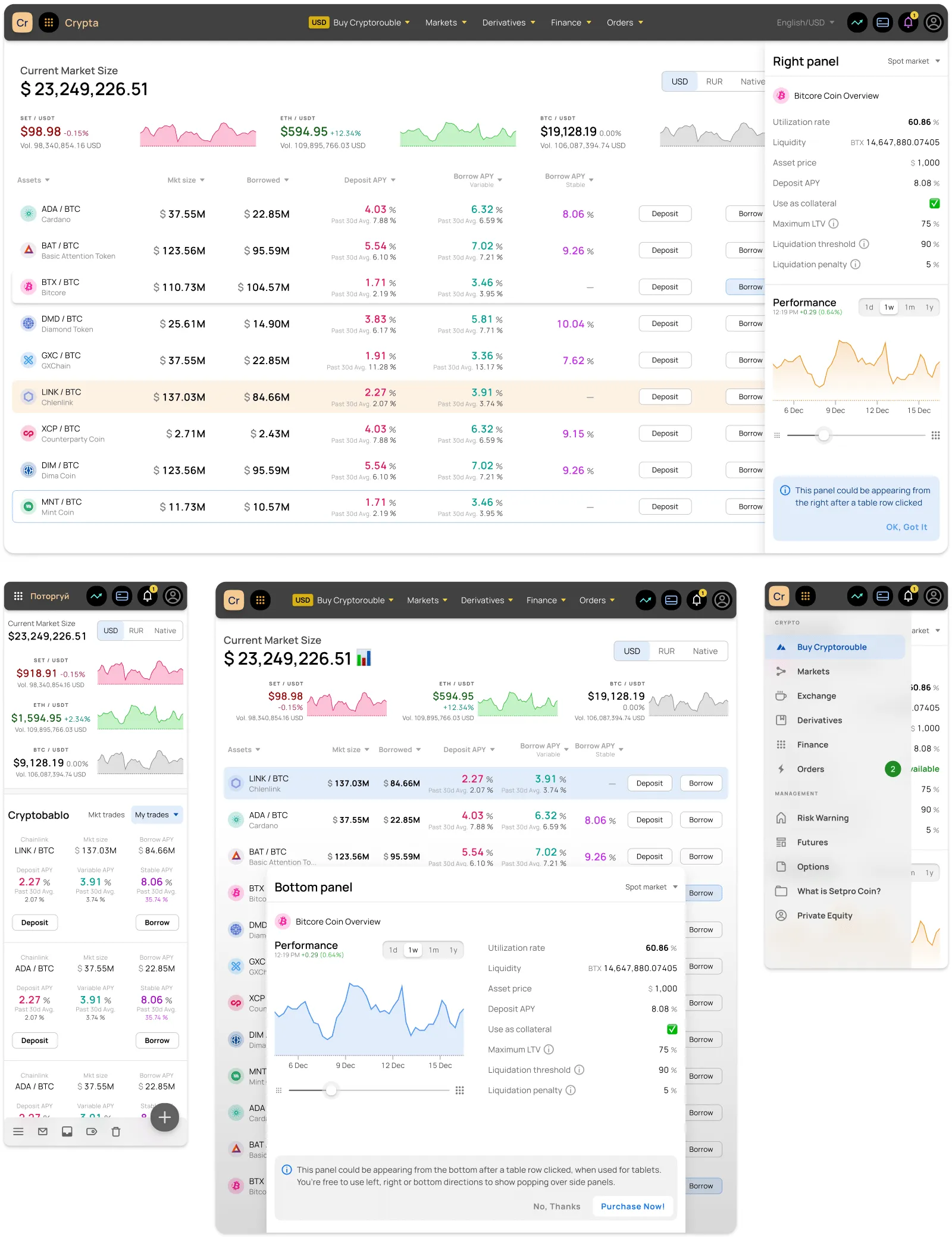
At the moment there are already more than 40 of them, and we are constantly working on updating this collection. They are thoughtfully assembled with the reuse of the same components, so your developers will never have questions like, "Hey, how is this supposed to be rearranged on mobile screens?"
And all of them are responsive and scalable for different screens.
You can use all of them as is, or reconfigure them for the specific needs of your project. Feel free to detach, disassemble as you want, insert other components, etc. Everything is done with AutoLayout, so filling everything with your content is quick and convenient.
Conclusion. Is it worth purchasing the UI kit?
So maybe you are a designer, a developer, or a startup with a minimum or no experience in design whatsoever. Or maybe you are experienced enough, have a bunch of side projects, and no time to draw pixels from scratch. UI kits can solve all those problems. You can make a small investment in buying Material-X and start creating stunning, aesthetic, and most importantly – professional designs for apps and websites.
And here you have 2 options:
-
One-time purchase. This is a classic model that we have run since we started our business. It's ideal for people who prefer to buy the UI kit once.
-
Subscription-based. This is a more dynamic type and it becomes a favorite model for our clients. We integrated this concept recently because we wanted to unlock more value from our customers and deliver better products as a result.
This means that now you can subscribe to our system for 3 months, complete your project for a significantly lower price (compared to a one-time purchase), and then subscribe again when required. A subscription grants updates that we add through the Figma team library to the Assets panel. Our clients receive them through updates (blue circle over the book icon in Figma).
So here is how this works: you pay for Membership on Gumroad, receive an invite by email within 24 hours with subsequent access to the project. Next, you click on Open in Figma, in the upper right corner click on the New File (+) → Assets → Team Library button (book icon), turn on Material-X, and in the Assets section, choose any element you need from the list of components. You can't duplicate them, but you can drag and drop them into your project and design interfaces according to your needs. (If you need a visual instruction - see this gif).