The Art of logo design: Strategies for crafting a lasting visual identity

How to design a logo which is something unique and emotive giving to the people a reason to care about the brand.

Inspiration

Published on

February 28, 2023

|

2 mins read

Blog

Logo design ideas for creating a lasting visual identity

Navigation

Subscribe to newsletter

Thank you! Your submission has been received!
Oops! Something went wrong while submitting the form.

By subscribing you agree to with our Privacy Policy.

Share this post

Roman Kamushken

<span class="blog_big-paragraph">Are you looking to create an original logo that captures the essence of your brand, sets it apart from the competition, and creates an emotional connection with your customers?</span>

If so, then get acquainted with several principles helping to avoid falling into the trap of relying on clichéd design approach. Learn about the common logo design tips for creating a visual identity that stands out from the crowd.

It's easy to fall into the trap of a cliche, such as a brick icon for a building contractor or a kitchen accessory for a restaurant. But a logo should do more than simply communicate what a company does. It should capture it's values, giving to the people a reason to care about the brand.

Whether you're a graphic designer, a marketing professional, or a brand design agency, this guide will help you design an original logo that is both visually appealing and effective in conveying the principles and identity of the brand.

{{spacer-24}}

TL/DR

  • Avoid logo design clichés and create something unique and non-standard.
  • Focus on fonts to convey a sense of professionalism and quality.
  • Consider the context in which a logo will be seen.
  • Incorporate symbolism to convey a brand's values and story.
  • Showcase with mockups to illustrate how the logo will be experienced.

{{spacer-64}}

Know your brand

Before you start designing, take some time to get to know your brand. Research the brand's mission, values, goals, and target audience. Read through any existing brand guidelines. Look at their competitors, what they are doing well, and what could be improved.

Ask your client for some analytics, talk to stakeholders to get a better understanding of the brand and what they are trying to achieve. Look at other logos in the industry; this can help you come up with creative solutions and avoid cliches.

{{spacer-64}}

{{setproduct-gpt}}

{{spacer-64}}

Think beyond imagery

A logo is more than just a picture, and it doesn't have to include an image or symbol to be effective. Think of iconic logos like the Nike swoosh or the Apple logo — both are simple and effective, and neither is reliant on a product-specific image.

Instead, they communicate values and create an emotional connection with their customers. Consider ways to capture a brand's essence without relying on a literal representation of the product or service.

{{spacer-16}}

Material UI Kit Built with Next.js and Tailwind CSS
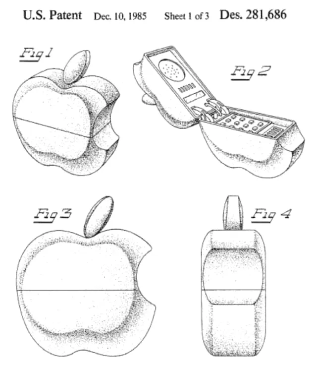
Have you ever knew that Apple patented this phone yet in 1985?

{{spacer-64}}

Focus on fonts

A powerful logo should communicate something about the brand, and fonts can be a great way to do that.

Consider using a bold, modern font that expresses the brand's personality and values. If a brand is all about fun and creativity, look for a font that translates such a message through it's shapes, curves and the mood. For representing reliability and professionalism, a more traditional and structured font may work better.

Select the typeface carefully, as it can be the first thing a customer notices about the logo and will shape their first impressions of the brand.

{{spacer-16}}

Material UI Kit Built with Next.js and Tailwind CSS
Regardless the logo for Binghamton Whalers may look like "W", "H", or "B"; people are highly grading such a logo design considering this branding definitely in their Top 5 sports logo list.

{{spacer-64}}

Consider context

Logos don't exist in a vacuum — they exist in the real world, whether that's on packaging, a storefront sign, or a billboard. Consider the context in which a logo will be seen and create something that fits such a space.

For example, a logo that looks great on a manufactured item may not translate well to a website, or storefront sign. Think about how and where the logo will be experienced in it's intended context and design something that achieves the brand's purpose.

{{spacer-16}}

Material UI Kit Built with Next.js and Tailwind CSS
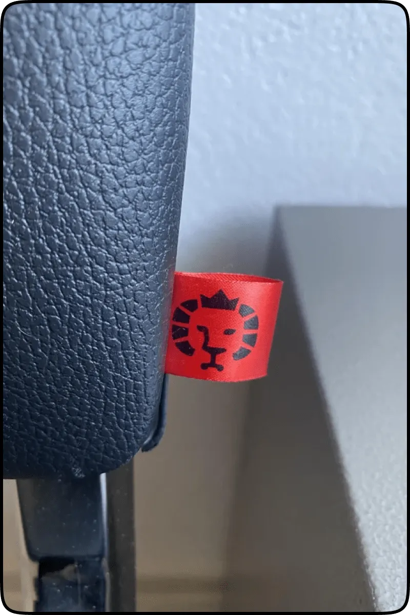
See a hidden chair here?
The lion sits tonight

{{spacer-64}}

Play with visual hooks

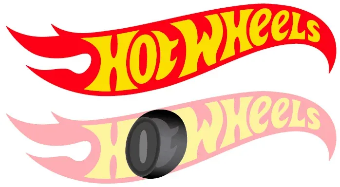
If a logo does need to include an icon or image, it doesn't have to be a literal representation of the product. Look for creative ways to incorporate visual hooks that convey the brand's values and story.

For example, Hot Wheels' logo cleverly incorporates a hidden tire in the letter "O", conveying a sense of speed and power. Try to incorporate visual hooks that are subtle but still capture the essence of the brand.

{{spacer-16}}

Material UI Kit Built with Next.js and Tailwind CSS
Who would have thought there's a hidden wheel

{{spacer-64}}

Showcase with mockups

Mockups are a great way to get creative with logo design and show how it will look in the real world. Rather than presenting a logo in the middle of a giant white square, simulate a world around it on packaging, a storefront, a banner, or a billboard.

This will help to illustrate how the logo will be experienced in its intended context.

{{spacer-16}}

Material UI Kit Built with Next.js and Tailwind CSS
Duff beer fictional rebrand. Having a bit of fun with a project that's been in the sketchbook for a while.

{{spacer-64}}

{{stars-conclusion}}

{{spacer-64}}

Conclusion

Through thoughtful logo design, designers can create a lasting visual identity, one that conveys the brand's essence and stands out from the competition.

Let's summarize the crucial points:

  • Think beyond imagery and focus on fonts.
  • Consider the context in which the logo will be seen.
  • Incorporate symbolism that conveys the brand's values and story.
  • Get creative with mockups.
  • Avoid clichés and create something unique and impactful.

If you'd like to learn more about logo design and stay up to date on the latest trends and techniques, be sure to subscribe to our newsletter. You'll get the latest tips and tricks, design inspiration, and more delivered straight to your inbox.

Cover image credit: Ramotion Inc., Dribbble

Share this post

Subscribe to Setproduct

Once per week we send a newsletter with new releases, freebies and blog publications
Oops! Something went wrong while submitting the form.

By clicking Sign Up you're confirming that you agree with our Terms and Conditions.

Congratulations!

You're in! Expect awesome updates in your inbox

Related posts

Lorem ipsum dolor sit amet, consectetur adipiscing elit.

Inspiration

6 mins read

Monetizing the design: what I learned after a year of non-stop UI grinding

Discover 15 key insights for successful digital products, from a UI designer who took matters into his own hands to create innovative designs for everyone.

Inspiration

2 mins read

Buttons UI design - Figma to React styled components

Enhance Material Design components for improved performance, usability, and visual appeal. Get our expert retouching services for your web design needs.

Inspiration

3 mins read

How to create UI kit - Design system to sell worldwide

Boost productivity and earn rewards with our design asset that accelerates work processes. Start optimizing your workflow today.

Figma Templates & UI kits

Save time and human resources by reusing hundreds of pre-made templates crafted by us. Based on top notch UX taken from the World's best apps.

Material X for Figma

Figma library with 1100+ components & 40 app templates beyond Material Design. Powered by top-notch shapes and Manrope font. Customizable & Adjustable UI kit now available for Angular & Figma

Material You UI kit

Figma & React library with 2600+ variants of 32 components compatible with Material Design 3. Plus 220+ dashboard templates for all the viewports. Now available for NextJS & TailwindCSS.

Figma React UI kit

Designed and well-organized in Figma React-based UI toolkit for the web. Optimized for building complex data-dense interfaces for desktop and mobile applications.

Panda Design System

Figma library with dashboard, calendar, kanban, profile, table, ecommerce and 80+ templates in total. Components with variants, dark theme included.

Eclipse UI kit

Figma library with 1100+ components & 74 templates for data-driven web applications. Powered by auto-layout. Supercharged by Figma's variants.

Rome UI kit for Figma

Customizable and well-organized team library. Contains 250+ components & 30 web app templates powered by stylish and trendy guidelines.

Material Design System

Figma library is based on 100% guidelines compliance with Material.io. Contains ready‑to-use templates to accelerate app UI design.

Neolex Dashboard UI kit

Customizable & adjustable dashboard design system with 50+ ready-to-use app layouts, 1900+ variants for 30 components with auto-layout.

Material Desktop Dashboard UI kit

Figma library with 48+ dashboard templates based on reusable desktop app patterns carefully handpicked from the most popular web apps.

Xela UI kit for Figma

Figma library with 1900+ variants of 30 components categories to craft perfectly shaped desktop & mobile apps. Customizable & Adjustable dashboard design system with 50+ web app templates.

Figma S8 Design System

Figma design library for mobile and desktop apps made of high quality styled components. Full version includes 67 dashboard templates.

OE Figma Design System

Customizable and well-organized Figma library. This design system aimed to build highly loaded interfaces, boost the speed and save more costs.

Figma iOS kit

Figma library of iOS patterns served as ready-made templates. This UI kit inspired by World's best apps. Based on Human Interface guidelines.

Figma S8 Design System

Figma design library for mobile and desktop apps made of high quality styled components. Full version includes 67 dashboard templates.

Most iOS UI kit for Figma

iOS native components and app templates organized into a «Most Design System» fully compatible with Apple's Human Interface guidelines.

Rome UI kit for Figma

Customizable and well-organized team library. Contains 250+ components & 30 web app templates powered by stylish and trendy guidelines.

Material Design System

Figma library is based on 100% guidelines compliance with Material.io. Contains ready‑to-use templates to accelerate app UI design.

Nucleus UI

Nucleus UI contains 1000 components and variants with 500+ mobile screens designed for Figma (including 9 themes from Event, E-commerce, Finance, NFT, etc.).

Figma Android UI kit

Components-driven Android mobile UI library for Figma. Consists of 140 high quality application templates made of total 250+ UI components.

Mobile X UI kit

Customizable & adjustable iOS / Android design system loaded with ready-made 157 app templates based on 860+ variants for 20 components.

Appka iOS UI kit

Customizable & adjustable iOS design system with 4100+ variants for 28 components and 280+ ready-to-use app layouts crafted for Figma.

Full iOS UI kit

Customizable iOS design system with 320 ready-to-use app layouts. You can modify them or use as it is to save time and never design from scratch again.

Xela for Flutter

XelaUI for Flutter is a simple, modular and accessible component library that gives you the building Flutter apps for mobile and desktop.

Xela for Android

Ready-made collection of fully customizable widgets, UI screens and reusable components for Android coded with Jetpack Compose.

Xela for Swift

Designed for iOS Developers. We provide fully coded customizable components, widgets and well-organized iOS screens for Figma & SwiftUI.

Material You UI kit

Figma & React library with 2600+ variants of 32 components compatible with Material Design 3. Plus 220+ dashboard templates for all the viewports. Now available for NextJS & TailwindCSS.

Figma Charts UI kit

Components-driven graphs design kit for dashboards, presentations, infographics & data visualisation. Includes 25+ charts types for all the viewports.

Hyper Charts

Create impressive visuals with Figma's graphs templates – dozens of scalable and customizable data visualization blocks for dark and light modes.

Orion UI kit

Figma library with 40+ full-width charts templates served in light & dark themes. Contains 200+ of dataviz widgets that look perfect on desktop & mobile screens.

Xela for React

React based components library for beautiful user interface in React apps. Lightweight library for your projects. Contains pre-made web app templates.

Figma React UI kit

Designed and well-organized in Figma React-based UI toolkit for the web. Optimized for building complex data-dense interfaces for desktop and mobile applications.

Material X for Figma

Figma library with 1100+ components & 40 app templates beyond Material Design. Powered by top-notch shapes and Manrope font. Customizable & Adjustable UI kit now available for Angular & Figma

Xela for Flutter

XelaUI for Flutter is a simple, modular and accessible component library that gives you the building Flutter apps for mobile and desktop.

Xela for Android

Ready-made collection of fully customizable widgets, UI screens and reusable components for Android coded with Jetpack Compose.

Xela for Swift

Designed for iOS Developers. We provide fully coded customizable components, widgets and well-organized iOS screens for Figma & SwiftUI.

Material You UI kit

Figma & React library with 2600+ variants of 32 components compatible with Material Design 3. Plus 220+ dashboard templates for all the viewports. Now available for NextJS & TailwindCSS.

Xela for React

React based components library for beautiful user interface in React apps. Lightweight library for your projects. Contains pre-made web app templates.

Levitate 3D kit for Figma

Components-driven 3D kit to design eye-catching Figma presentations. Helps to enhance your landing page, product or app, brand ident, etc.

Website templates UI kit

Landing pages reusable templates kit based on most effective web design patterns. 140+ dark & light constrained design blocks.

Figma Landing Pages UI kit

Landing pages templates library based on constrained & organized components aimed to speed-up the production of effective websites.

Zeus UI kit

Create hassle-free landing pages in Figma. This kit is based on 10 landing page templates, powered by 1600+ variants for 630+ web blocks.

Research, copy and ideate with SetGPT!

We've launched the alternative ChatGPT clone dedicated to UI designers, UX researchers, writers and indiehackers.

Powered by the latest OpenAI gtp-3.5-turbo model, this free chatbot is the perfect tool for those in need of intelligent and innovative insights, wrapped with a slick UI and sophisticated user experience.

Start now

SetGPT is a free service; however, authentication is required

This is some text inside of a div block.