


Roman Kamushken
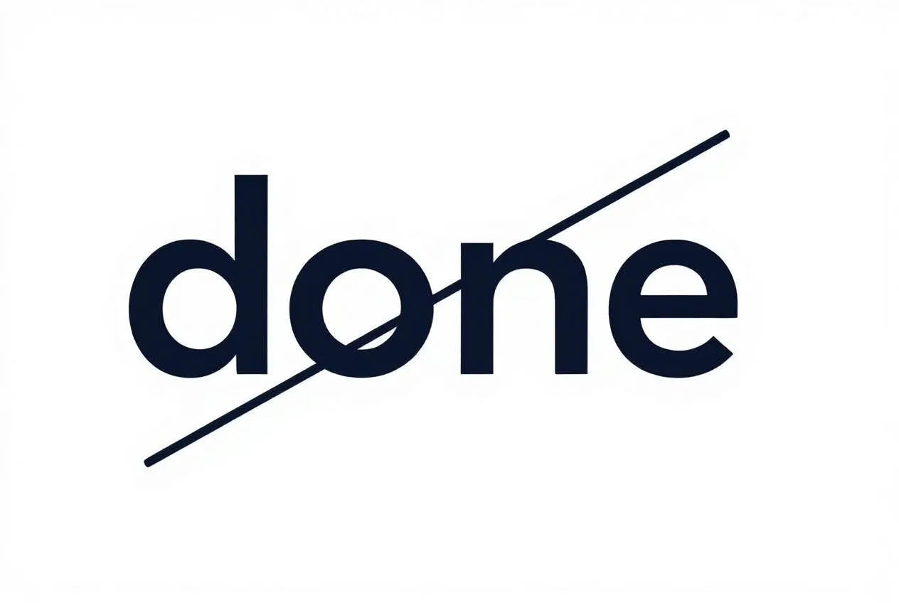
In interface design, small visual details often create the strongest impact. A shift in color or a subtle fade can change how users perceive actions. One of the simplest yet most overlooked patterns is strikethrough text.
We’ve all seen it - an old price crossed out, a completed task marked as done, or a message retracted. Beyond these cases, strikethrough is rarely considered as a design tool. Most designers either hide content with opacity or remove it completely. Both approaches risk leaving users uncertain about what just happened.
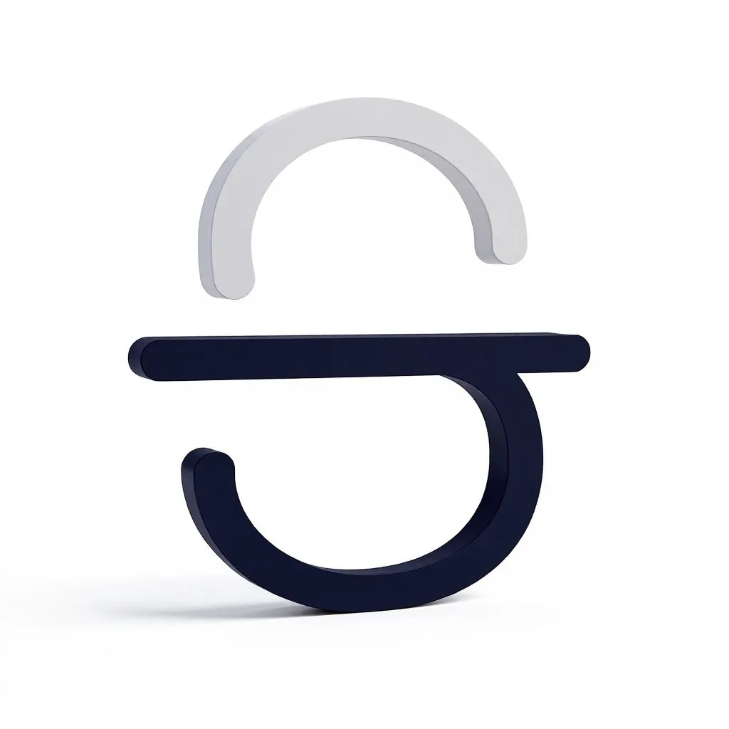
Strikethrough is the underrated visual cue; by contrast, communicates change while keeping context visible.
Why strikethrough works so well
The strength of strikethrough lies in how instantly recognizable it is.
Humans learn very early that drawing a line through words or numbers means “not valid anymore.” On paper, people cross out wrong answers, mistakes, or outdated notes. Interfaces borrow this convention, giving it immediate familiarity.
From a cognitive perspective, strikethrough preserves context while signaling a change.
• When an element disappears completely, users are forced to rely on memory: what was just there?
• When opacity is reduced without other signals, the meaning can be ambiguous: _is this disabled, inactive, or gone?_
Strikethrough eliminates that uncertainty. The element remains visible, but clearly communicates its altered status. Compared to full deletion, strikethrough prevents disorientation.
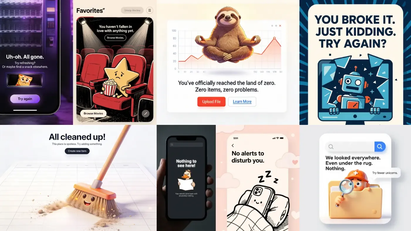
Common use cases across interfaces
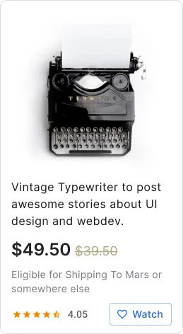
E-commerce: discounted prices are almost always shown with strikethrough applied to the original amount. The cue is immediate and powerful: value is emphasized without extra words.
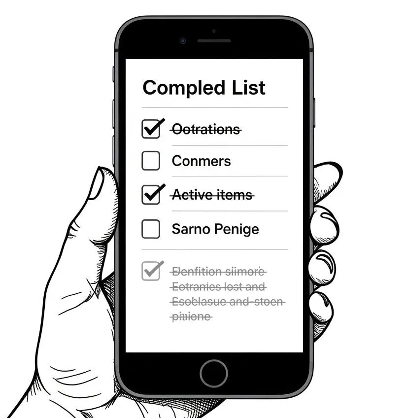
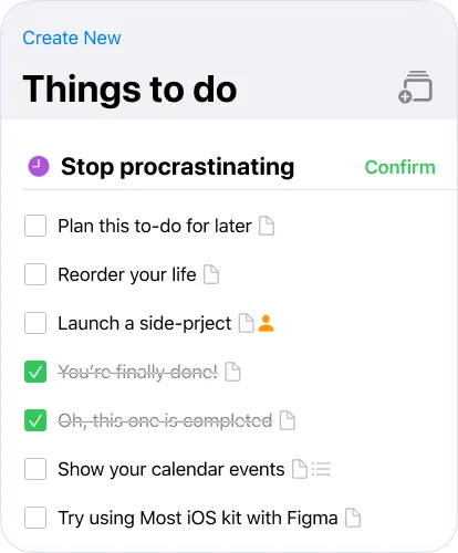
Task managers: crossed-out tasks visually separate completed items while keeping the list intact. It is one of the most common productivity patterns, and for good reason.
Messaging apps: when a message is edited or retracted, a strike can preserve conversational integrity while clarifying that the original text is no longer valid.
Settings and selection UIs: in a list of options, a deselected item may remain visible but crossed out. This communicates change without breaking flow or hiding content entirely.
Content review: Editors in collaborative tools often rely on strikethrough to mark deletions. It provides a lightweight audit trail that is easy to scan.
Sometimes HiDream generation model lacks about text, but overall Venice.ai deserves an attention, if you're looking for battle-tested UI design image generation tool
Best practices for designing with strikethrough
Keep it subtle - The line should be light and not overpower the text. It needs to mark change, not destroy readability.
Pair with complementary cues - Opacity reduction or color shifts can strengthen the signal. For example, crossing out text while lowering transparency makes the meaning unambiguous.
Think about accessibility - Screen readers may not announce strikethrough. Always combine the effect with semantic cues such as aria labels or visible hints like “completed.”
Stay consistent - If strikethrough means “completed” in one place, it should not mean “disabled” in another. Define its role in your design system and use it uniformly.
Test with typography - Different fonts render lines differently. Adjust thickness or vertical alignment so the mark looks sharp and the text remains legible.
Common questions about strikethrough
• Why not just delete the element completely?
Because deletion erases context. Users may forget what was removed or question whether the action succeeded. Strikethrough preserves the original element while clarifying that it is no longer valid.
• Isn’t strikethrough old-fashioned?
It may feel retro, but that is exactly why it works. The convention is instantly recognizable across generations and cultures. Familiarity makes it powerful.
• How do users with visual impairments handle it?
Strikethrough alone is not sufficient. Screen readers may ignore the visual line. Designers should add semantic cues, such as labels or aria attributes, so that the meaning is accessible.
• Should strikethrough always be paired with a fade effect?
Not necessarily. Fading can add clarity, but in some contexts, the line itself is enough. The decision depends on the density of the interface and the importance of the state change.
• Does it work equally well on mobile and desktop?
Yes, though mobile screens require extra care. Smaller text sizes mean the line must be adjusted for clarity. Testing on high-resolution displays ensures the effect remains sharp.
• Can it be animated without distracting users?
Yes. A brief cross-out animation can be elegant, but it should be restrained. Overly dramatic motion can feel theatrical rather than functional.
Duplicate this screen straigth into Figma
• What alternatives exist if strikethrough doesn’t fit the brand style?
Alternatives include dimming, blurring, or using a “disabled” style. Yet none communicate invalidation as directly as strikethrough. If the brand avoids it, designers should still seek a comparable cue that preserves visibility while signaling change.
Conclusion: a tiny line with oversized impact
Strikethrough is one of the lightest touches a designer can add, but its value is large. It preserves context, clarifies change, and strengthens user trust without heavy UI overhead. Unlike animations or complex states, it requires only a single line of CSS and a clear usage rule.
As designers, we often seek flashy patterns or dramatic transitions. Yet sometimes, the smallest details make the biggest difference.
Strikethrough is one of those details. Before you hide or delete an element, ask: would it be more helpful for the user to see it crossed out?
In many cases, the answer will be yes.

.webp&w=1920&q=75)
.webp&w=1920&q=75)

.webp&w=1920&q=75)
.webp&w=1920&q=75)


.webp&w=1920&q=75)
.webp&w=1920&q=75)


