

Jeff Flipper
If you have ever tried to pay for a global subscription while living in a country where getting an international card is painful, you already know the problem. You have the money, you want to pay, and the payment rails are simply not on your side. This review is my honest attempt to tell you whether SolCard fixes that, what it actually costs, and where it falls short.
Affiliate disclosure: I earn a small commission when readers sign up through my SolCard link. It doesn't change anything you pay, and it doesn't change my assessment - this review reflects six months of real spending.
TL;DR
→ What it is: a virtual, crypto-funded Mastercard you top up with USDT, USDC, SOL, or SOLC and spend online wherever cards are accepted.
→ Best for: paying ChatGPT, SaaS, and other USD-denominated subscriptions when a local bank card will not work abroad.
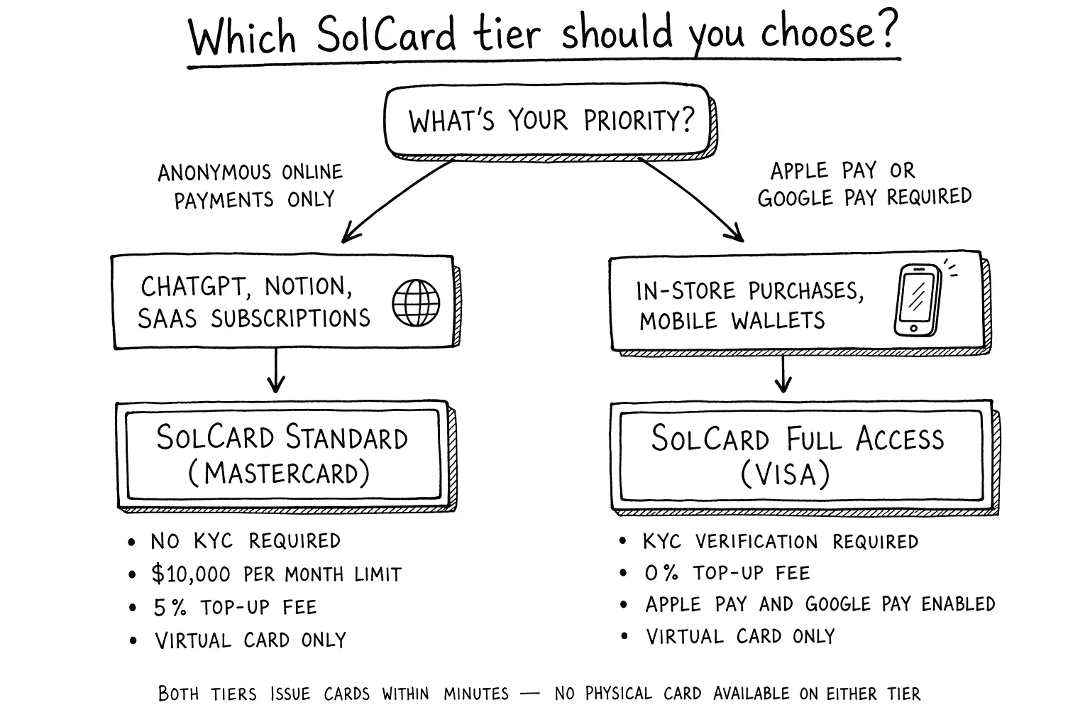
→ No KYC: real for the basic virtual Mastercard tier; the verified Full Access tier (Visa, Apple Pay, Google Pay) does require verification.
→ Real fees: 5% top-up, $0.30 per transaction, +2% on FX, $10 Mastercard issuance, and a $1 monthly fee. Light use is cheap, heavy micro-spending is not.
→ Watch out for: restricted countries (including the US and Russia), a required $5 minimum balance, and merchant-side declines that no card can promise to avoid.
→ My take: worth it as a spending wallet for subscriptions, not as a place to park money. If you want to test it, you can use my SolCard referral link and start small.
What is SolCard (and who it's for)
SolCard is a virtual prepaid Mastercard that you fund with crypto instead of a bank transfer. According to SolCard's own help docs, you top up with USDT, USDC, SOL, or SOLC, the card is denominated in USD, and once funded you use it like any other card at online checkouts.
The reason to bother is simple. It lets you spend stablecoins like USDT without first going through a bank card you cannot get, and without constantly converting to fiat through an exchange. If you keep working balances on Solana already, the money moves from your wallet to a spendable card in minutes.
So who is this actually for? In my experience the honest audience is narrow but real:
→ People in countries where international Visa or Mastercard issuance is restricted or unreliable.
→ Freelancers and founders paid in stablecoins who need to pay for SaaS and AI tools in USD.
→ Solana users who want a native way to spend USDC or USDT without leaving the ecosystem.
If you already have a working international bank card with low fees, you probably do not need this. SolCard solves an access problem, and if you do not have that problem, the fees below will feel like pure overhead.
Is SolCard legit? Trust signals to check
"Is it a scam" is the first thing anyone types about a crypto card, and it is the right question. I cannot certify any provider as risk-free, so instead of giving you my opinion alone, here are the concrete trust signals I checked, and how you can verify them yourself before sending a cent.
→ Public documentation. SolCard maintains a help center with fee pages, deposit rules, and terms of use. Vague projects hide this. A provider that publishes exact numbers is easier to hold accountable, and it lets you cross-check every claim in this review.
→ Mastercard issuing rails. SolCard issues through card-network partnerships, which is why KYC rules differ by card type. That structure is normal for the industry, and it is the same reason new Visa issuance moved behind verification.
→ Consistent funding model. The card is prepaid. You can only spend what you load, so there is no credit exposure and no hidden borrowing. The most you can lose to a single mistake is the balance you put on it.
→ A working withdrawal path. Funds are not a one-way street. SolCard documents a withdrawal flow (in USDT, with a small fee and a required minimum balance), which matters a lot for trust.
☞ My practical rule: treat any crypto card as a spending wallet, never as savings. Load what you plan to spend in the next week or two, run a small test purchase first, and keep the rest in your own wallet. That single habit removes most of the real risk regardless of which provider you pick.
KYC and privacy, the honest answer
This is the section most reviews get wrong, so let me be precise. SolCard's help center explicitly claims No KYC required to start, and that matches its instant-issuance positioning for the basic virtual Mastercard. For a lot of people, that is the entire appeal, and it is genuinely true for that tier.
But "No KYC" is not a blanket promise across the whole product. SolCard later introduced SolCard Full Access, a verified tier. Their own announcement states that new Visa issuances (the ones tied to Apple Pay and Google Pay) are available only to Full Access users, while Mastercards remain unaffected. Their Terms of Use also says KYC depends on the card type.
So the honest take splits cleanly in two:
☞ If your goal is a quick virtual card for online payments, you can likely start with minimal verification on the basic Mastercard tier.
☞ If your goal is in-person Apple Pay or Google Pay through a Visa product, expect identity verification to show up.
That is not the provider being dishonest. It is how card-issuing partnerships work in 2025 and 2026: the network and the banking partner set the verification rules, and consumer-facing brands have to follow them once a product touches certain rails.
On privacy more broadly, remember that the merchant still sees a card payment, and the card network still processes it. A crypto-funded card removes the bank-account link at the funding step, but it is not anonymity. If your threat model needs true anonymity rather than access, no virtual card review should sell you on that, and this one will not.
How fees actually add up, a worked example
Fee pages are easy to skim and then regret. So instead of listing rates in the abstract, here is a concrete scenario using SolCard's documented fees, the exact way I burned through my first top-up.
The setup: I load $100 in USDT, then pay for ChatGPT Plus at $20 and two smaller services at $10 each in the same month. Here is the line-by-line breakdown.
| Line item | Rate (per SolCard docs) | Cost |
|---|---|---|
| Top-up $100 in USDT | 5% of deposit | $5.00 |
| ChatGPT Plus, $20 | $0.30 tx + 2% FX | $0.70 |
| Service A, $10 | $0.30 tx + 2% FX | $0.50 |
| Service B, $10 | $0.30 tx + 2% FX | $0.50 |
| Monthly account fee | flat | $1.00 |
| Total fees on the month | $7.70 | |
| Of $100 loaded, spent on services | $40.00 | |
| Effective overhead on real spend | ~19% |
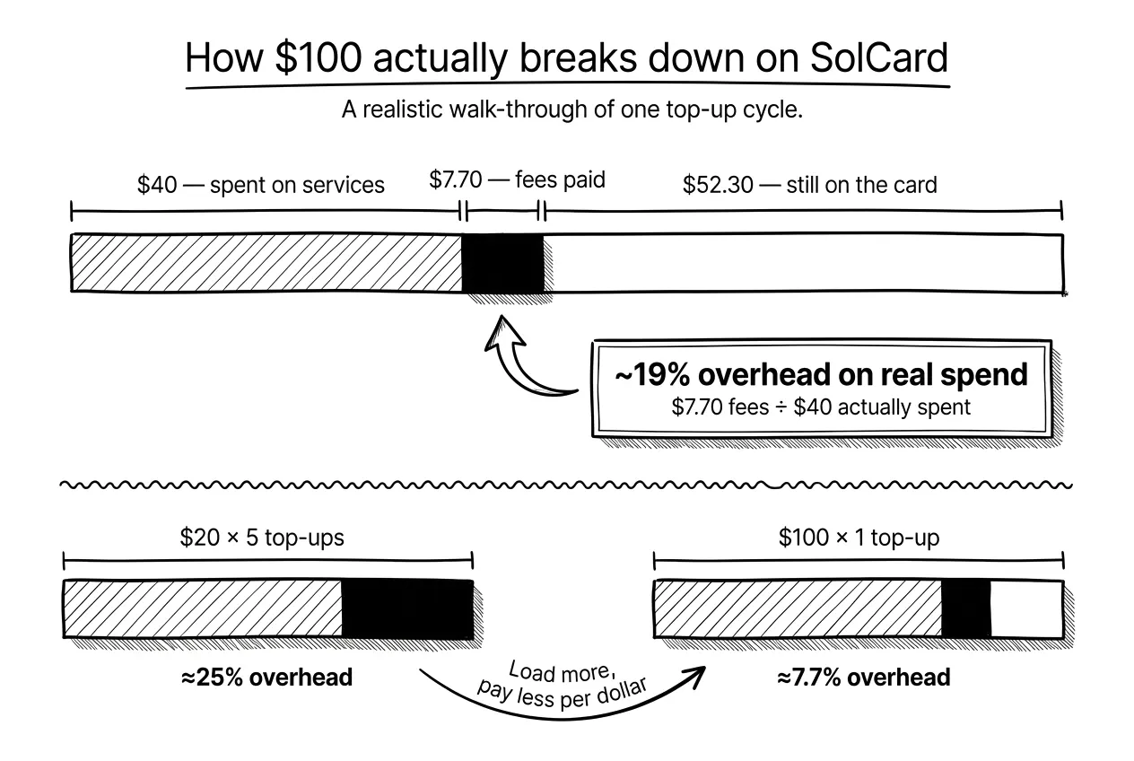
A few honest observations from that table. The 5% top-up fee is the big one, and it is front-loaded: it hits the whole deposit, not each purchase. That means larger, less frequent top-ups are far cheaper per dollar than topping up $10 at a time. Load $100 once and the 5% is diluted across everything you buy that month. Load $20 five separate times and you pay that 5% five times over.
The per-transaction and FX fees are small in absolute terms but they punish micro-spending. A flurry of $3 and $4 purchases will feel disproportionately expensive because of the $0.30 floor and the under-$10 small-purchase fee of $0.15. For two or three subscriptions a month, the math is fine. For pay-per-use micro-billing, it is not.
☞ The takeaway: SolCard is priced like a subscription-spending tool, not a daily debit card. Use it that way and the cost is predictable. Always confirm current numbers on SolCard's fee page before you rely on them, since prepaid-card pricing changes more often than anyone would like.
SolCard vs alternatives, comparison table
The comparison below shows two SolCard tiers, because the KYC story is not binary. The Standard Mastercard tier stays no-KYC up to $10,000 a month, while the Visa Full Access tier asks for verification in exchange for Apple Pay support and a 0% top-up fee. I verified SolCard's rows against its current help center, cross-referenced each other provider's official docs, and marked any cell the provider does not publish. All figures reflect publicly published rates as of June 2026.
| Card | KYC | Top-up fee | Per-tx fee | FX fee | Notable trade-off | Best for |
|---|---|---|---|---|---|---|
| SolCard Mastercard (Standard) | None up to $10,000/mo | 5% | $0.30 | +2% | Virtual only, no Apple Pay or Google Pay | Anonymous online subscriptions paid in USDT or USDC ¹ |
| SolCard Visa (Full Access) | Required | 0% | $0.30 | +2% | KYC needed, but unlocks Apple Pay and Google Pay | Frequent spenders willing to verify identity ¹ |
| CardUpNow | None | $5 per virtual card issued | Not published | Not published | One card per merchant or use case | Facebook and Google ad campaigns, one-off vendors ³ |
| Solflare Card | Required | N/A, self-custody, no top-ups | 1% | Not published | Virtual and physical, spends straight from your wallet | Solana natives who finished KYC and want the lowest fees ² |
| PayGate.to | None | 4-7% by country and PayPal terms | Not published | Not published | Different model, PayPal-balance hybrid for merchant flows | Specific PayPal-acceptance use cases |
| Wise (fiat) | Required | None, bank transfer | None | Mid-market rate + 0.3-1% markup | Fully fiat, no crypto funding option | Users with verified bank accounts in supported countries |
¹ Verified from help.solcard.cc/en/articles/11500204, June 2026 ² Verified from help.solflare.com and solflare.com/guides/, June 2026 ³ Verified from cardupnow.com/fees-and-usage-policy, June 2026
Numbers above come from each provider's official documentation as of June 2026. Prepaid card pricing changes frequently, so always confirm the current rate on the provider's site before committing to a top-up. Cells marked "Not published" mean the provider does not publicly disclose that number; contact their support for exact figures.
Quick read of the comparison. For pure no-KYC online subscriptions, SolCard Standard and CardUpNow are the two real options, but they solve different problems. SolCard wins on funding flexibility, since you fund one card with several stablecoins and keep reloading it. CardUpNow wins on per-merchant isolation if you run many separate vendors or ad accounts on disposable cards. If you are willing to complete KYC, Solflare's 1% per-transaction fee and self-custody model are currently the lowest-fee way to spend on Solana. PayGate.to is here because readers search for it next to SolCard, though it is primarily a merchant payment gateway rather than a personal spending card. Wise is the reference point: if you already have traditional banking access, you do not need any of the others for everyday spending, but you give up crypto funding entirely.
When SolCard makes sense (and when it doesn't)
After six months, my view has settled into a clear yes-and-no.
It makes sense when:
→ You cannot reliably get an international bank card, and your country is not on SolCard's restricted list.
→ You are paid in stablecoins and spend on USD-denominated SaaS, AI, and design tools.
→ Solana is already your primary chain, so funding is fast and cheap on your side.
→ You want a few recurring subscriptions covered, not a daily-driver debit card.
It does not make sense when:
→ You already hold a low-fee international card. The 5% top-up and 2% FX are pure overhead you do not need.
→ You plan to store a meaningful balance. This is a spending wallet, not a savings account, and you must leave a $5 minimum anyway.
→ You need guaranteed acceptance at a specific strict merchant. No virtual card can promise that, and risk checks vary.
→ You make lots of tiny purchases. The per-transaction and small-purchase fees add up fast.
If you land in the "makes sense" column and want to test the workflow before committing real money, the cleanest entry point is to register at SolCard and load a small amount first.
How I tested SolCard
So you know this is hands-on rather than a rewritten press release, here is exactly what I did over roughly six months of use.
I opened the basic virtual Mastercard tier first, specifically to test the No KYC claim, and confirmed it issued without identity verification. I funded it with USDT on Solana in three separate top-ups: a $30 trial load, then $100, then $150 once I trusted it. I deliberately tested a small top-up first so the 5% fee on a tiny amount would not sting if something failed.
For real purchases I ran a recurring ChatGPT Plus subscription at $20/month, two smaller SaaS tools in the $10 range, and one deliberately small under-$10 purchase to confirm the small-purchase fee behaved as documented. I also triggered one intentional decline (insufficient balance for purchase plus fees) to see the declined-transaction fee in action, and it matched the published range.
Finally I tested the exit: a withdrawal back to USDT, which confirmed the documented $1 withdrawal fee and the required $5 minimum remaining balance. Everything in the fee section above comes from numbers I actually paid, cross-checked against SolCard's help center. If you want to replicate this exact test, you can start from my SolCard link and follow the same small-first approach.
FAQ
Is SolCard safe to use?
It is a prepaid card, so your maximum exposure is the balance you load, with no credit or borrowing involved. It issues on Mastercard rails and publishes fee, deposit, and withdrawal documentation, which are reasonable trust signals. That said, no crypto card is risk-free. The safest approach is to treat it as a spending wallet: load only what you plan to spend soon, run a small test purchase first, and keep the rest in your own wallet.
Does SolCard require KYC?
For the basic virtual Mastercard tier, SolCard advertises No KYC to start, and in my testing it issued without identity verification. The verified Full Access tier is different. New Visa issuances tied to Apple Pay and Google Pay require verification, and SolCard's terms state that KYC depends on the card type. So you can start without it, but expect verification if you want the in-person Visa features.
Can I pay for ChatGPT with SolCard?
Yes, this is one of the most common uses, and I ran a recurring ChatGPT Plus subscription on it during testing. Keep in mind that no virtual card can guarantee acceptance everywhere. Some merchants apply strict billing and regional checks. SolCard also warns you to keep enough balance to cover both the purchase and its fees, otherwise the transaction can decline. For predictable subscriptions like ChatGPT, it works well in practice.
What are SolCard's fees?
SolCard's main costs are a 5% top-up fee and a $0.30 per-transaction fee, plus a +2% FX fee on cross-border purchases. Light subscription use stays cheap, frequent micro-spending does not.
Full fee schedule:
→ Top-up: 5% of each deposit
→ Per transaction: $0.30
→ FX or cross-border: +2%
→ Small purchase under $10: +$0.15
→ Declined transaction: roughly $0.15 to $0.50
→ Mastercard issuance: $10 one-time
→ Monthly account fee: $1
→ Withdrawal: about $1 in USDT
→ Minimum balance: $5 must remain
Always confirm current rates on SolCard's official fee page.
Which networks does SolCard support for deposits?
SolCard started Solana-first with USDT, USDC, SOL, and SOLC, then added multichain stablecoin deposits across more than ten networks, including Ethereum, Polygon, BNB Smart Chain, Arbitrum, Optimism, Avalanche, and Base.
Its early docs warned that sending from an unsupported network could lose your funds. Availability can still depend on your card type and dashboard, so always confirm the exact network inside the app before sending anything.
Does SolCard work with Apple Pay and Google Pay?
Apple Pay and Google Pay support exists, but it is tied to the verified Visa product under SolCard Full Access, and the help center lists support in 53 countries. The basic No KYC virtual Mastercard is built for online checkouts rather than in-person tap payments. If mobile-wallet and in-store use is your main goal, plan on the Full Access tier and the verification that comes with it.
Is SolCard available in my country?
SolCard describes itself as usable worldwide, but it maintains a list of restricted jurisdictions, including the United States and Russia. Before signing up, check SolCard's current country and restriction list, since these rules change often.
Some features, especially the Apple Pay and Google Pay support across 53 countries, are also tied to specific card types and regions. A restricted jurisdiction is the most common reason an otherwise valid account cannot be used, so confirm your location is supported first.
What is the minimum amount to start with SolCard?
There is no large barrier to entry, which is part of the appeal, but the fee structure rewards larger, less frequent top-ups because the 5% applies to each deposit. In testing I started with a $30 trial load to keep my risk low while confirming the card worked. A practical starting point is enough to cover one or two months of the subscriptions you actually plan to pay, plus a small buffer for fees and the required $5 balance.
Can I withdraw funds from SolCard?
Yes. SolCard documents a withdrawal flow in USDT with a fee of about $1 that covers blockchain costs. The catch is that you must leave a $5 minimum balance, so you cannot drain the card to zero.
I tested this directly and it behaved as documented. A working exit path is one of the stronger trust signals for any prepaid crypto card, so it is worth confirming yourself before you load a larger amount.
SolCard vs a regular bank card, which should I use?
If you can get a low-fee international bank card, use it. SolCard's 5% top-up and 2% FX fees are overhead you would be paying to solve a problem you do not have. SolCard wins in exactly one situation: when reliable card access is genuinely out of reach, when you are paid in stablecoins, or when you want to spend on Solana without converting to fiat first. It is an access tool, not a cost-saving one.
Final verdict
After six months of real use, SolCard earns a qualified recommendation. It does the one job it promises: it turns USDT into spendable USD at online checkouts, fast, with a low verification threshold on the basic tier. The fees are fair for occasional subscription spending and clearly documented, the No KYC claim is honest if you read the tier rules, and there is a working way out. The catches are real too: restricted countries, a $5 minimum, and pricing that punishes micro-spending. Use it as a spending wallet, not a vault, and it delivers. If that fits your situation, you can create your SolCard here and start small.


