

Roman Kamushken
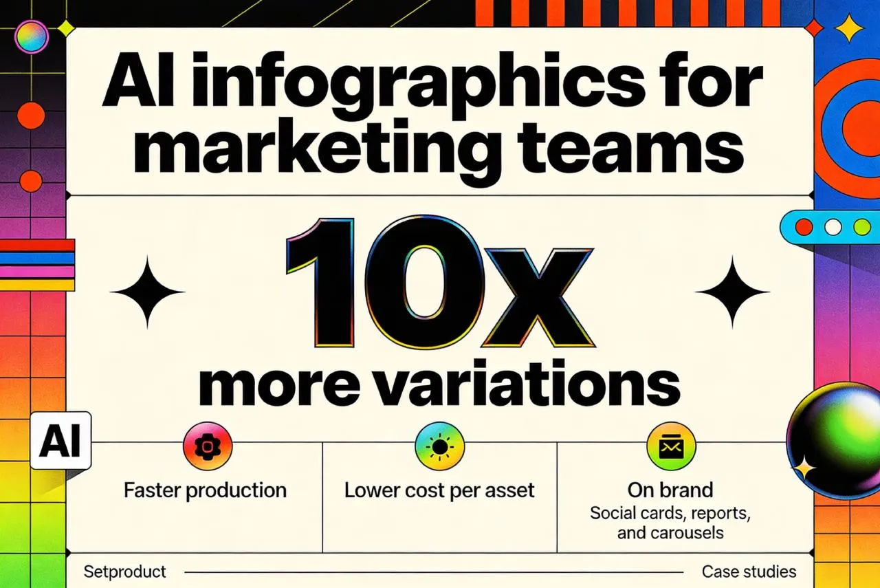
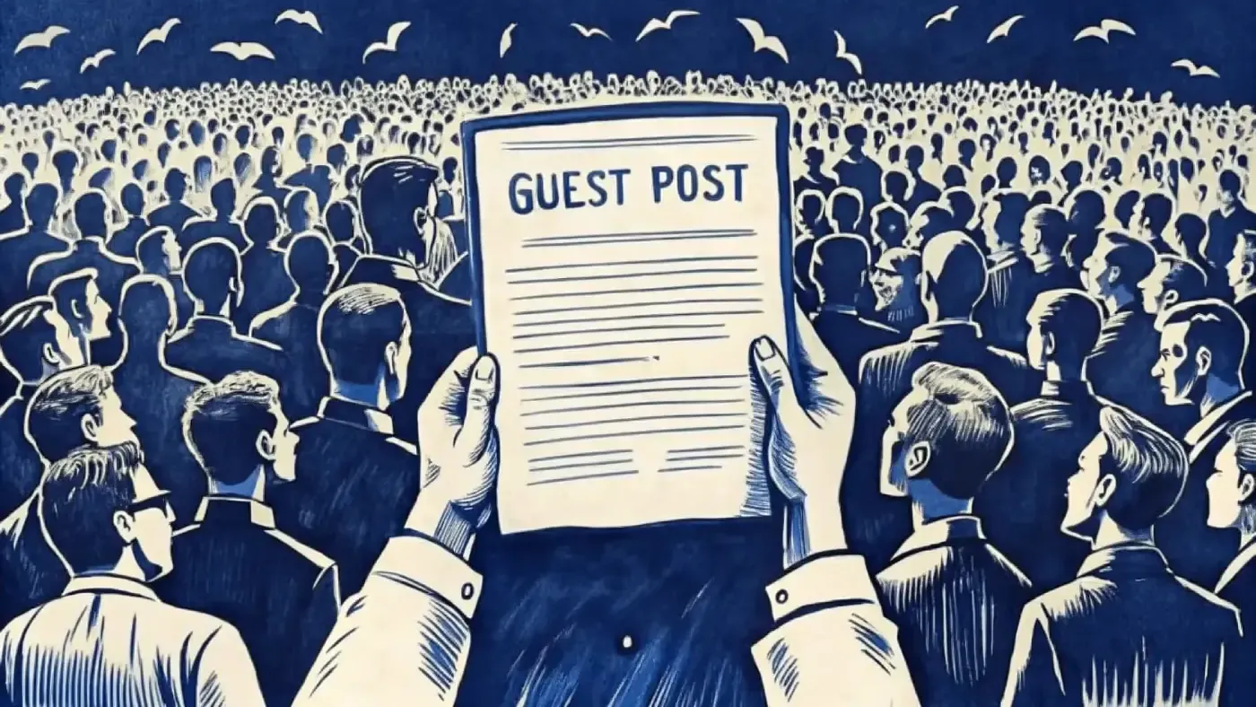
Marketing teams do not need “a beautiful chart”. They need content units that travel well: LinkedIn stat cards, Instagram carousels, press snippets, newsletter visuals, landing page blocks. The job is to make one idea land in two seconds, with brand consistency and credible numbers.
AI changes the economics of this work. You can explore dozens of layout and style directions in the time it used to take to build one careful composition by hand, then polish only the winners. Venice.AI supports 70+ style presets and multiple image models, so variation is not a bonus, it is the default.
Below is the exact algorithm I use for the most common audience: marketing, content, SMM, PR.
Define the job: what “AI infographic for social media” really means
For marketing, the main formats are usually “data cards” (one insight, one number), micro comparisons (A vs B), simple timelines, and small dashboards that summarize results.
The key shift: you are not designing a chart library.
You are designing a repeatable content system that can produce 10 to 50 assets per month, without the audience getting tired.
Two practical rules that save you early:
Rule 1: message first, chart second. If you cannot write the takeaway in one sentence, the infographic will look busy no matter how good the styling is.
Rule 2: typography wins before decoration. If your numbers and labels are not readable in a feed preview, shadows and gradients do not matter.
If you want to test this approach on your own numbers, send me one sentence with your key takeaway plus 3 to 5 metrics.
I will reply with a suggested card structure and a Pilot quote. No calls, async only. Contact: hello@setproduct.com
A strong infographic is a content unit, not a decoration. One message, one hierarchy, instantly readable in a feed.
Client intake: what data you actually need to produce infographics
AI does not remove briefing. It makes briefing more valuable, because you can test directions quickly and keep the best logic.
Here is the only checklist I need from a client. If they give me several of this, we move fast:
- Goal of the infographic set (awareness, lead gen, press credibility, internal reporting)
- Distribution channels and sizes (LinkedIn post, LinkedIn carousel, Instagram 4:5, story 9:16, blog embed)
- Audience and reading context (cold feed, email, landing page)
- Brand kit (logo, fonts if any, brand colors, examples of past visuals)
- Tone constraints (strict corporate, playful, premium, “techy”, minimal)
- The data itself (CSV, Google Sheet, a table in Notion, or a simple list of metrics)
- Units and definitions (what exactly the number means, time window, source)
- One sentence takeaway for each card (what should people remember)
- Must-avoid items (competitors, sensitive numbers, claims you cannot prove)
- Approval workflow and deadline
If the client only has “an idea” but no data, you can still help: propose an infographic concept, define what numbers would make it credible, and request them. If they have data but no idea, you turn data into narrative by ranking insights by surprise and relevance.
Want me to turn your data into a clear infographic set?
Share a CSV, a sheet link, or even a simple list of metrics, plus your brand references. I will confirm what is usable, what needs clarification, and propose the fastest path to publish-ready visuals. No meetings needed. Contact: hello@setproduct.com
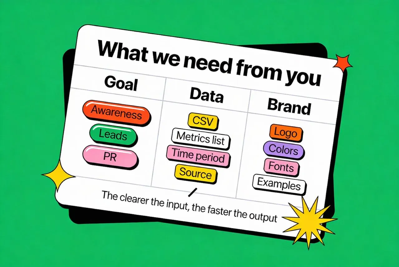
Great visuals start with clean inputs. Clear metrics, time window, and brand references remove guesswork and speed everything up.
Turn raw numbers into a “visual spec” before prompting
Marketing infographics fail when the visual is correct but the point is vague. So before generating anything, you write a visual spec, a short decision document.
A good spec contains:
Primary takeaway (one sentence).
Primary metric (number, unit, time window).
Supporting context (comparison, baseline, sample size, data source).
Chart or structure choice (bar, line, stacked, comparison table, timeline).
Attention plan (what gets the biggest typographic weight, what becomes secondary).
Risk check (what can be misread, what needs a footnote).
This step is also where you decide whether the card is a “data visualization” or a “data poster”.
In feeds, the most effective cards are often posters with a small chart, not charts with a small headline.
Before generating anything, define the takeaway. A one sentence spec turns raw numbers into a clear story.
Build prompts like a system, not like poetry
Build prompts like a system, not like poetry.
A reliable AI infographic pipeline uses a prompt template. You want repeatability, not surprise.
A strong prompt usually has five blocks:
❶ Format and layout: canvas ratio, grid, margins, safe zones.
❷ Content structure: headline, number, unit, small chart, footnote.
❸ Styling: typography mood, contrast, background treatment, stroke and shadow rules.
❹ Brand constraints: color palette guidance, logo area, tone.
❺ Negative constraints: avoid messy backgrounds, avoid extra icons, avoid illegible micro text.
On Venice.AI you can choose models depending on your goal. Their API quickstart highlights Nano Banana for highest quality, GPT Image as a premium level, and Qwen Image for faster production runs (models are actual for the end of 2025).
If your team wants repeatable results, I can build a prompt system tailored to your brand and content goals, then produce a consistent series month after month. Send 2 existing visuals you like, your palette, and 5 example metrics, and I will outline the exact production plan. Async workflow only. Contact: hello@setproduct.com
You can also apply a style_preset, which Venice exposes via a styles endpoint (examples include “HDR”, “Advertising”, “Flat Papercut”).
For social infographics I usually generate at 1024x1280 (4:5 aspect ratio) or 1280x1280 (square), however Venice’s generate endpoint supports width and height up to 4K upscaled.
Prompts are your design system. Structure and constraints create consistent results, not random AI noise.
Generate variation intentionally: style lanes and selection rules
The “cheap speed” of AI is wasted if you generate random outputs. You want controlled exploration.
I run style lanes. Same content, different visual logic. Examples: minimal editorial, bold poster typography, soft glass UI, data report look, neon tech look.
In Venice I can request multiple variants per prompt (the API supports 1 to 4 images per call). The goal is to produce a small grid of options and judge them with the same rubric every time:
→ Readability at thumbnail size.
→ Data clarity and hierarchy.
→ Brand fit.
→ Pattern potential (can this become a series of 20 infographic cards).
Only after you pick a lane do you start refining. Refinement means tightening layout, reducing noise, and making the series consistent, not “adding more”.
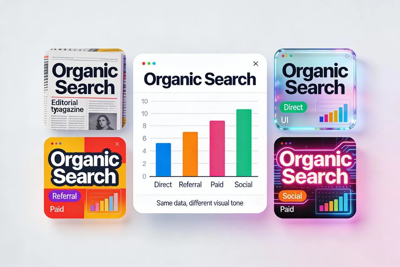
Same data, multiple style lanes. You are buying curated options, not endless revisions.
Production and delivery: how to ship results that clients can actually use
A hard truth: most AI image outputs are raster. Venice’s image API returns common formats like PNG, JPEG, and WebP.
That is fine for marketing distribution, because social platforms and most CMS pipelines consume raster anyway.
Where raster becomes a problem is client-side editing. If the client expects to “open a file and tweak text”, pure raster delivery will disappoint.
So I offer two delivery modes:
Mode A: ready-to-post pack. High quality raster exports in the exact sizes needed, plus a content spreadsheet that maps each card to its copy, numbers, and source. This is the fastest and usually the best value.
Mode B: editable rebuild add-on. I use the AI output as an art direction reference, then rebuild the chosen layout as an editable template (typically Figma). This is slower, but it gives the client a more or less reusable system.
Not sure whether you need raster-only or editable templates?
Tell me where you will use the visuals (social, blog, ads, print) and whether your team must edit numbers later. I will recommend the best delivery mode and price it transparently. No calls, just async. Contact: hello@setproduct.com
For higher resolution needs, Venice provides an Upscale feature that can double or quadruple resolution, and an optional Enhance step.
If the client wants print, this becomes relevant. If it is purely social, 4:5 and square at high quality PNG is usually enough.
Also important for commercial clients: Venice states that usage rights belong to you for generated images.
Delivery that fits real workflows. Publish-ready exports by default, editable templates when your team needs control.
Before AI vs now: why this workflow wins for marketing
Before AI, you had two common paths.
Path one: a designer builds everything manually in Illustrator or Figma, one layout at a time. Quality can be high, but iteration is expensive, and you rarely test enough options to be sure you picked the best direction.
Path two: you use template tools. They are fast, but everyone looks the same, and custom brand nuance is limited.
Now you can combine the good parts. Generate a wide set of art directions quickly, select based on performance logic, then polish only what deserves polishing. Venice’s multi model setup and style presets make this kind of exploration practical, not theoretical.
If you want leads, this matters: marketing teams care about speed and consistency more than “designer ego”. The strongest offer is not “I can draw charts”, it is “I can ship a branded infographic system and keep it running every month”.
A simple way to start is a pilot: 10 infographic marketing cards in one style lane, in the client’s sizes, with an approval loop and a repeatable spec.
If it performs, you scale the series.
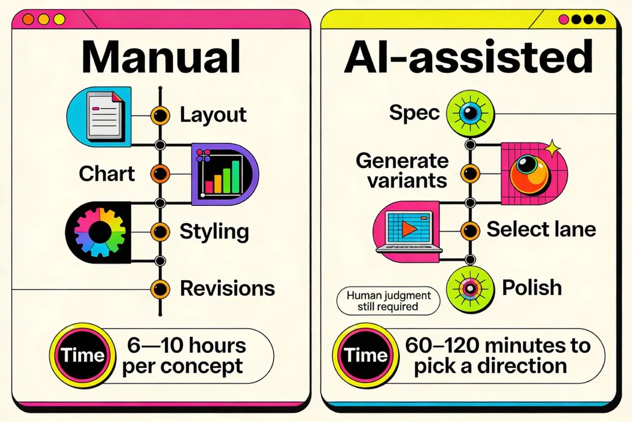
Manual design is slow iteration. AI-assisted production explores more directions faster, then polishes only what wins.
FAQ. What clients usually ask first
❶ What can I send you as data?
A CSV, a Google Sheet, a screenshot of analytics, or even a written list of metrics is enough. The critical part is units, time window, and source, so we do not produce misleading visuals.
❷ Can you match my brand exactly?
Yes, within reason. For a perfect match I need your brand fonts and a few existing examples. When fonts are non-negotiable, the editable rebuild mode is the safest option.
❸ Will the numbers be accurate if AI renders text?
I do not trust tiny AI-rendered text by default. For important numbers, we either keep text large and simple, or we do a final typography pass so the published asset is correct.
❹ Do I get editable source files?
The default delivery is a ready-to-post raster pack (PNG or WebP).
If you need editable templates, I offer an add-on where the selected style is rebuilt as a clean Figma template.
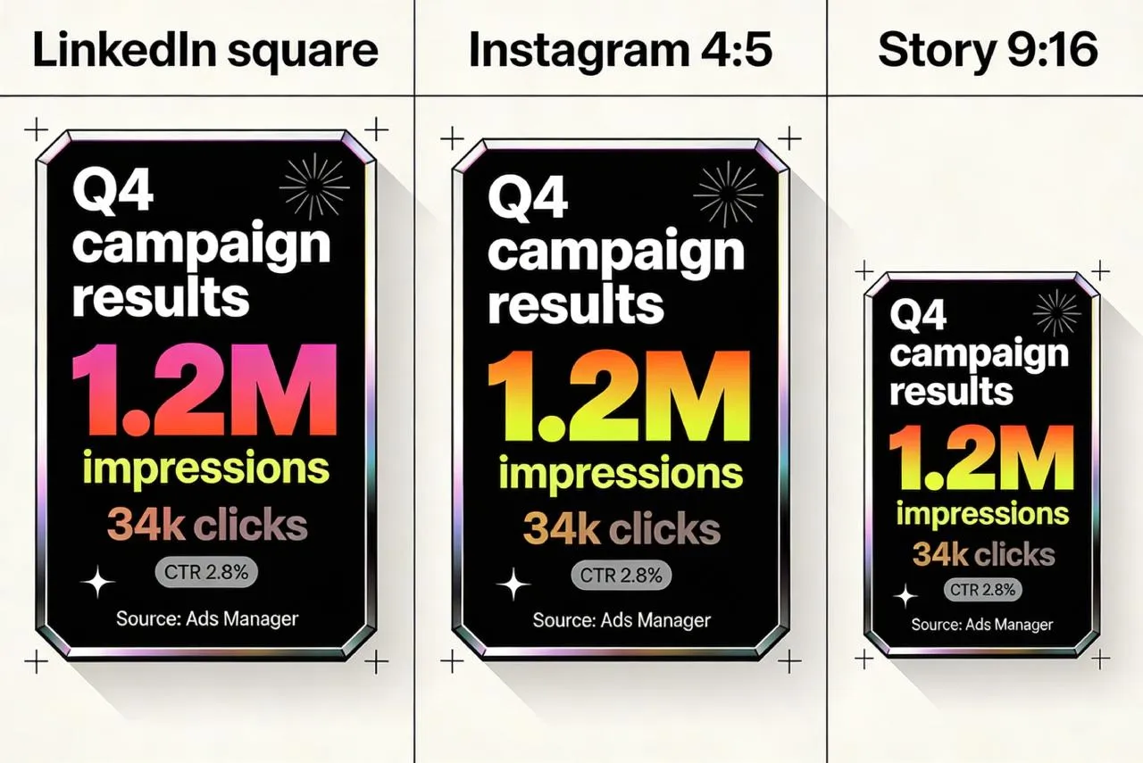
❺ What sizes do you deliver for social?
Typically square (LinkedIn), 4:5 (Instagram feed), and 9:16 (stories). We agree on the platform list upfront and I deliver in the exact sizes you need.
❻ How fast can you deliver the first batch?
A pilot batch is usually quick because we start with a single style lane and a clear spec. Speed depends mostly on how complete the data and definitions are.
❼ Can I use the images commercially?
Yes, that is the point. Venice states that usage rights belong to you for generated images.
For sensitive industries, I still recommend internal review of claims and wording before publication.
How I charge for AI infographics without confusing math
Marketing teams want two things at once: predictable cost and predictable output. So the simplest pricing is not “per hour”, and not “per image”. It is pricing by batches, with clear boundaries.
What you are actually paying for
You are not paying for one beautiful picture. You are paying for a repeatable process: turning messy metrics into publish-ready cards that look consistent, read fast, and do not create “what does this number mean?” problems.
To keep scope clear, I treat one deliverable as one “card in one size”. A square card and a 4:5 version count as two deliverables, because spacing and hierarchy must be reworked, not resized.
What makes a project cheaper or more expensive
Most requests become expensive for three reasons.
First, the data is unclear. Missing units, missing timeframe, unclear definitions, or no source. Clarifying this is valuable work, but it adds time.
Second, the card is complex. A single stat card is fast. A multi-series chart, a map, or a dense comparison takes longer because there are more ways to confuse the reader.
Third, the brand requirements are strict. If you need exact typography behavior, precise palette rules, and consistency across a large series, we spend more time refining the system and less time generating random options.
Pricing plans without the headache
I keep three plans. They map to real marketing use cases.
Pilot.
Best when you want to test the workflow and see if the visuals fit your brand. You get 6 to 10 cards in one consistent style lane, delivered in one agreed size, with one revision round.
Typical budget: $400 to $900.
Monthly.
Best when you publish regularly and want a stable content engine. You get 12 to 24 cards per month, two output sizes per card, and a tighter “series look” so your feed feels intentional.
Typical budget: $1,100 to $3,000 per month.
Campaign.
Best when you need a bigger push: a launch, an event, a report summary, or a carousel-heavy month. You get 30 to 60 cards, more variation lanes upfront, faster turnaround windows, and stricter consistency across the set.
Typical budget: $3,000 to $7,000.
These ranges exist because the same number of cards can have very different complexity. A batch of simple stat cards is not the same as a batch with charts, maps, and multiple data series.
If you want to start with a low-risk test, the Pilot is the fastest option: a small batch, one clear style lane, publish-ready exports, and a repeatable spec. Send your goals and a rough list of metrics, and I will reply with scope, timeline, and a fixed quote. Contact: hello@setproduct.com
The editability question and the clean solution
Venice can output high quality raster images, which is perfect for social media and most web publishing, but it is not editable like a Figma file.
So I offer a clear rule: default delivery is publish-ready exports, and editability is a separate option.
If your team needs to update numbers later, I can rebuild the chosen style lane into an editable template system. This is a one-time add-on, typically $600 to $2,500, depending on how many layouts we convert into reusable components.
What you can expect from the workflow
You do not review dozens of raw generations. I generate variations, select a shortlist that meets readability and brand fit, then you choose the direction. After that, we scale it into a consistent series.


